Makeup Mania, INC.
Makeup mania, Inc.
This proposed responsive website was made in an attempt for makeup enthusiastic of all levels to be able to access the latest makeup trends, tutorials, and product reviews to enhance their skills and knowledge for all things makeup.
The main flow focus of this project is for users to be able to access makeup tutorial videos for those wanting to enhance their skills or wanting to try the latest trends. In addition to the design, research was conducted to create user personas, user journeys, and competitive audits while also performing usability studies.
*This project was done as part of the Google UX Design Certificate program and has not been shipped

project background
Business research
Getting to know the users
As part of the Google UX Design Certificate program, one of project was to design a dedicated mobile app followed by a responsive website that focused on social good. For this project I decided to chose a random prompted from Sharpen, which ended up being “design a responsive website for makeup enthusiastic to find resources for makeup tutorials and trends.”
As I continue to grow my experience in UX Design, I look forward to getting creative with the process to design this app. However, as any other app design process, it’s important to first better understand the business, competitors, and of course the users.
As a makeup fanatic, I was excited to design a website for all things makeup. Growing up I was always fond of makeup and would be in awe of those around me who would be able to create both unique and simple looks. Once I was able to do my own makeup I would buy every product I could and create endless looks. Spending hours practicing to perfect the latest trends and looks.
However, just because I had some starting opinions about the website - such as providing makeup tutorials, product reviews, and latest trends - that didn’t mean I knew exactly what other companies were doing….After all, the concept of makeup is known to be versatile and subjective to all.
Wanting the opportunity to come up with my own branding rather than borrowing existing concepts, I decided to create a fictional company called Makeup Mania, Inc. to be the client for this website. Makeup Mania, Inc. is an American media and technology that is the parent to media property Makeup Mania - a monthly subscription for all things makeup. Similar to most beauty websites, it also offer product reviews, latest trends, tips and tricks, and celebrity looks.
When it comes to finding makeup tutorials online, there are endless companies sharing articles providing written step-by-step tutorials, but unfortunately, they don’t provide video tutorials to show how the look comes together. Often people complain about not being able to visually see the end results of the tutorial causing them to be hesitant when it comes to trying it out themselves.
Keeping this in mind, the Makeup Manic, Inc. business decided it could be worth exploring a responsive website to solve the problem. The goal was that this website would allow makeup lovers to access the latest trends, tutorials, and makeup products, but would primarily focus on providing makeup tutorials in video form for users to follow along. Videos would be provided for users to follow tutorials depending on the look they want to achieve along with tips and tricks for those new to the world of makeup.
For the purpose of this project, you may assume that Makeup Mania, Inc. provides step-by-step videos on applying makeup.
Competitive Audit
Before designing the website, I had conducted a competitive audit to familiarize myself with what other companies were offering within their websites to better understand not only the companies but the market as well. Each of the features that competitors offered was evaluated on their visual design, the layout of the website, makeup tutorials, beauty trends along with ease of navigation . The key competitors identified were:
PopSugar - is an American-based company subscription website identified as a direct competitor. Marketing to be the country’s #1 go-to for all things makeup, Popsugar provides its subscribers with the latest makeup trends, tutorials and celebrity looks. In addition, the website offers a vast number of other beauty categories including hair and nails for its users to be able to learn not only makeup but also the latest nail trends and most popular hairstyles. Popsugar takes advantage of its upbeat approach and unique layout to engage its users to visit the website frequently to search for makeup trends and products.
L’OREAL - is an international makeup brand company identified as a direct competitor. It is the world's largest cosmetics company and has developed activities in the field concentrating on hair color, skin care, sun protection, make-up, perfume, and hair care. The company’s makeup website sells itself to be the one-stop shop for things related to makeup. The site sells itself to be a source for makeup tips, trends, and tutorials. It’s ultimate goal is to guide users through the world of makeup one product at a time.
Byrdie - is an online content platform that brings all things beauty, wellness, and style from the best products on the market, to the latest celebrity trends and instructional how-tos. The website is filled with beauty insiders and product reviews. Taking advantage of its online presences, the website is known for being interactive with it users throughout the site whether it’s using real pictures of other users or providing a little animation within each of their posts.
With each competitor providing it’s unique and individual approach towards providing makeup trends and tutorials, there wasn’t a single website that provided all features needed to be the one-stop location for all things makeup and beauty. While most provide an ample amount of articles the latest trends and top products, they lack in providing a visual images of the trends and products whether it be still pictures or video tutorials.
My overall takeaways from the competitive audit for each website are as follows:
Website Strengths Weaknesses
PopSugar - Real celebrity and user images with makeup looks - Lack of filter for searching specific tutorials
- Easy to navigate, select and view categories - Never-ending homepage
L’OREAL - Tutorials are broken down by eyes, face & lip - Too many external links for other sites
- Informative on the latest trends and tutorials - Tutorials are written out than provided via videos
Byrdie - Appealing visually design providing interactive posts - No option to save articles or posts to refer to later
- Easily able to navigate throughout the website - Homepage can be overwhelming to view
Makeup Tutorials - Easy to navigate with minimal tabs - Cluttered homepage and other tabs
- Tutorials broken down by type (day, night, work) - Unsure how latest the trends are - no context or date provided
YouTube - Easily able to search and follow tutorial videos - Not a makeup/beauty-specific website
- Can create playlists of videos to access later - Can get lost searching for makeup-related videos
Ulta Beauty - Virtual try-on feature is helpful for testing products - Makeup tutorials and trends are seen to be secondary on the website
- External links for tips and tricks on how to apply products - Heavy focus on selling makeup products
USER research
The first step for any user research is to get out there and talk to users, and this project was no exception. Prior to conducting any interviews, I knew my goal was to understand the challenges associated with searching for makeup tutorials and trends on the internet, in order to design a responsive website to help solve those challenges by targeting the KPIs faced by users. With this in mind, I set out to ask a select group of participants the following questions:
How often do you wear makeup on a daily basis?
Do you keep up with the latest makeup trends and tutorials?
How often do purchase makeup on a monthly basis?
Would you consider yourself to be a beginner, intermediate or advanced when it comes to your makeup skills?
Do you find it easy to find the latest trends and makeup tutorials online?
By asking these questions, I was able to easily confirm all selected participants fell into the target audience and found the challenges that came with finding makeup tutorials and trends online. Whether they considered themselves to be a beginner, intermediate, or advanced, each participant expressed they found it difficult to find makeup tutorials that provided a step-by-step video version for them to follow at their own pace. They found it hard to follow along with written tutorials noting that majority of them were vague as they lacked information on the techniques mentioned to achieve the look. In addition, many stated the number of websites provided outdated trends and looks making it difficult to see what’s new in makeup including, celebrity inspired looks or what the latest products in the market are. While others emphazied, how they have developed an interest in makeup but find it overwhelming when browsing through websites that have so many categories and tabs as they search for a beginner’s guide or just want to learn the basics of makeup.
While most people interviewed found to be excited for a responsive website providing access to the latest trends, makeup tutorial videos, product reviews, and insider tips and tricks on applying makeup, some were concerned that the website would become oversaturated with vast amounts of content making it hard to search for specific trends or makeup tutorials. Upon gathering information from the interviews, I was able to detect an overall primary group:
PERSONA
Conducting these interviews allowed me to develop a persona based on the primary group identified above. Though there was only one persona created to help better understand the group, there are many more that could have been also made to address other aspects and needs found within the individuals of the group.
USER JOURNEY MAP
While personas and user stories are a great way to empathize with the user, it’s difficult to have a true understanding of their challenges until we experience the difficulties they do. Thus, the user journey becomes an important aspect when needing to understand those real-time experiences. By creating a user journey map for Inaam’s persona, I was able to pinpoint issues that may need to be brought to attention for others on the team to see. Especially when there’s certain components within the process that the design team has no control over. When creating Inaam’s journey map, I had created it under the assumption that she had recently started developing an interest in makeup having little to no background when searching for tutorials online.
While only one persona and user journey map was created for the sake of this project, there are opportunities to highlight multiple other groups, personas, and user journeys to better understand the challenges faced by users.
PRIMARY GROUP
Individuals experiencing difficulties in searching for makeup tutorials in the form of videos in order to try out the latest trends and practice makeup looks on themselves. This group varies in both age and background ranging to be in various different points in life. Most are found to be beginners and intermediate when it comes to their makeup skills. Overall, this group would like to see a responsive website that can be used as a resource for all things makeup - from learning the basics to finding the best products to the latest celebrity trends and tips and tricks from professionals - in order to enhance their skills and continue to grow their knowledge about makeup and beauty.
PERSONA: INAAM SAIF
Inaam is a full-time graduate student while working as a general store manager at Nordstrom. Though not the biggest expert in makeup she is trying to find quick and easy tutorials to incorporate within her morning routine in order to look and feel presentable throughout her busy schedule between school and work requiring little to no touch-ups.
“It’s so hard finding simple make-up tutorials online to incorporate into my busy life. I just need to find a quick routine to be able to get out the door for my busy day”
From this, we can determine that Inaam, a full-time graduate student and employee, needs to find quick and easy makeup tutorials in order to look professional throughout her busy days between school and work.
Inaam’s User Journey
Inaam’s journey begins with searching for the makeup website on her desktop and navigating to its homepage. Curious to see what the website has to offer she begins to browse within the site looking through each tab and category to get a feel from of the website. Once able to navigate with ease, Inaam begins to narrow down her browsing by searching for simple makeup tutorials. Pleased with the results, she begins to look through each tutorial to figure out which beat suits for her. While going through the videos she was hoping there was a way to save them to watch later and for the site to provide external links to purchase the products used in the tutorial. Eventually, she finds a tutorial she believes is best for her and attempts to follow it step-by-step in hopes to incorporate it in her morning routine. For this user journey, the following improvement opportunities were identified:
Offer an app-friendly version to access through a mobile phone
Provide built-in filters to narrow down search
Include short description of videos to avoid watching unwanted tutorials
Provide an option for users to create an account and save videos and posts for future reference
Include external links to purchase products mentioned and/or used in the tutorials/posts
SITEMAP
Prior to drafting low-fidelity design, I started with creating a Hierarchial Sitemap to better organize the layout of the website to guide the organizational structure of each screen’s design to ensure a cohesive & consistent experience throughout the website. Allowing to show the fundamental structure of the overall website, and ultimately governing many other aspects of the site including demonstrating the connections between various pages within the website as shown below.
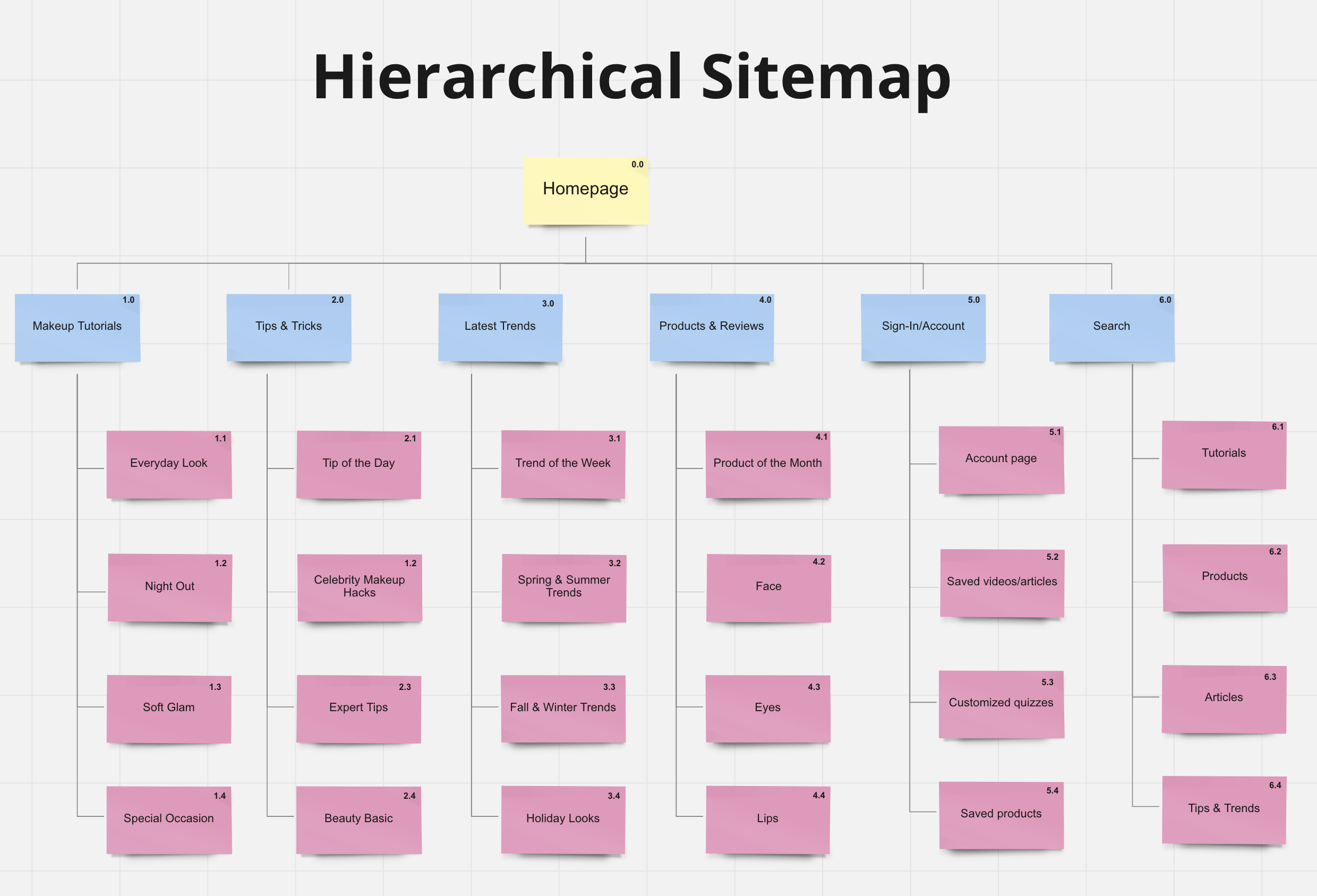
Initially, when designing the website, I wanted it to flow in a sequence of events that would make the most sense for users. After searching for the website, users will naturally land on the homepage filled with featured articles and topics related to beauty and makeup as well as categories leading to other pages within the website. However, wanting the main focus of this website to be providing makeup tutorials in the form of videos, I knew the flow I would design for the prototype would include searching for makeup tutorials through built-in categories for users to have a quick and smooth experience.
Explanations of each individual screen designs follow below.
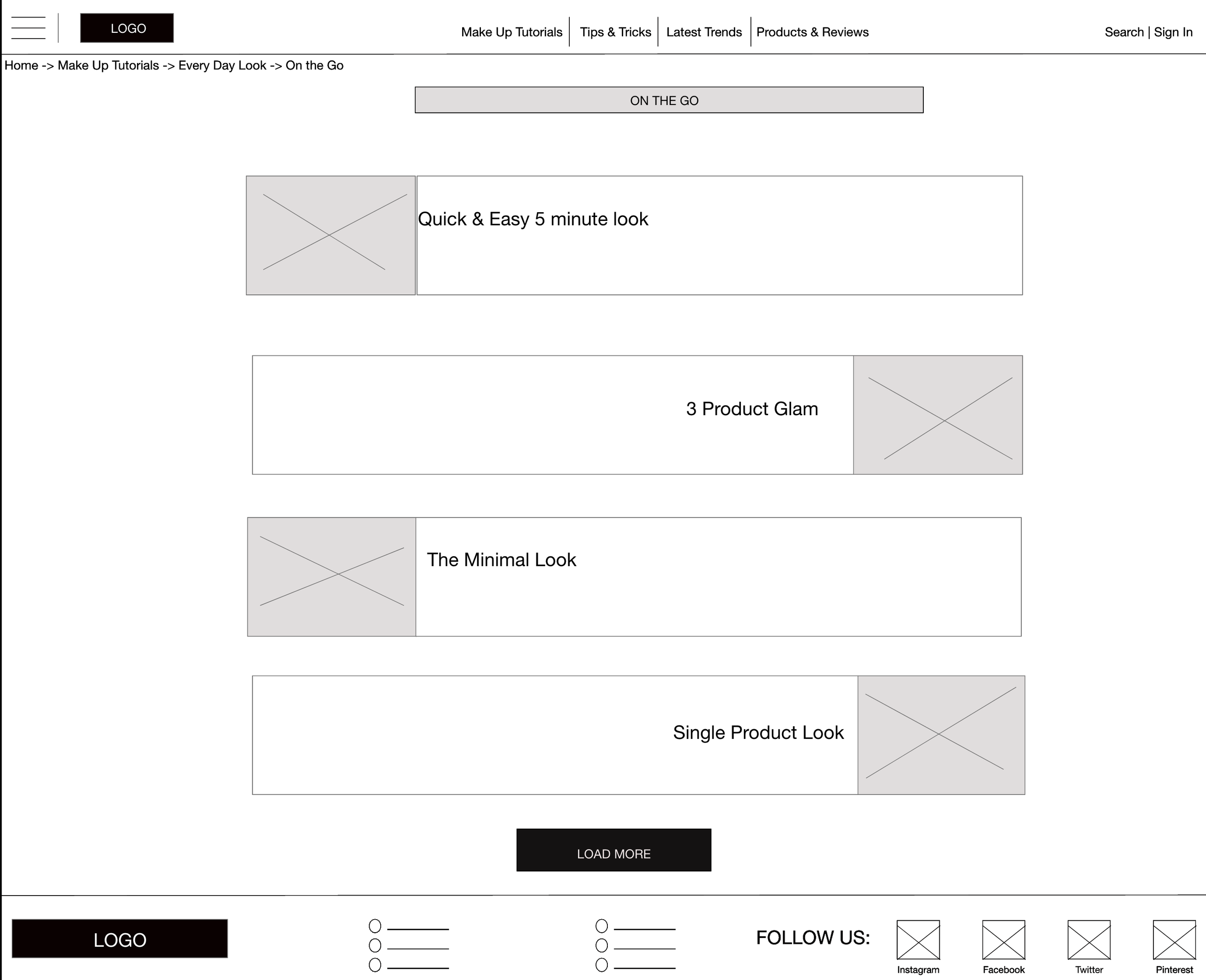
Low-fidelity Design
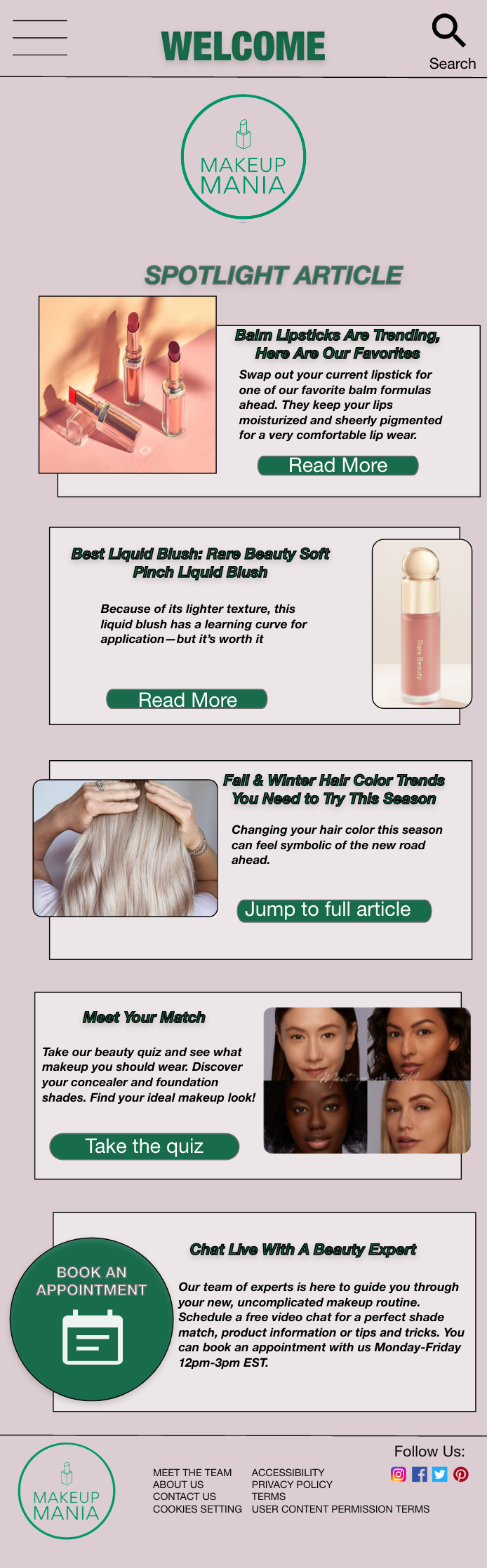
HOME
The home screen is the first screen users land on when on the website. Finding that similar apps tend to have too many topics and articles jumbled with an endless scroll, I wanted to utilize this page to be informative yet straightforward. The design allows highlighting the latest beauty trends and products while having clear call-to-action categories above them allowing users to easily navigate to other pages. While there are no call-to-actions on the main screen of the homepage itself, each feature section would bring up a screen with more information and links corresponding to each topic.
TOP BAR NAVIGATION
Wanting to keep the website as simple as possible, I decided to only create four main categories with one being “Make Up Tutorials” for users to easily navigate within the website and save time from endless searching. Of course, each main category leads to its own page, and from there are multiple sub-pages for users to access depending on what they are looking for whether it be overall beauty or makeup specific.
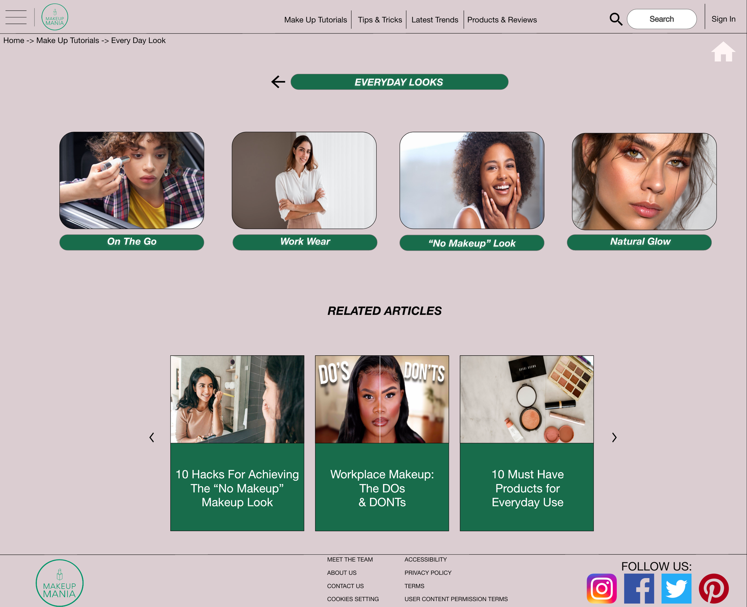
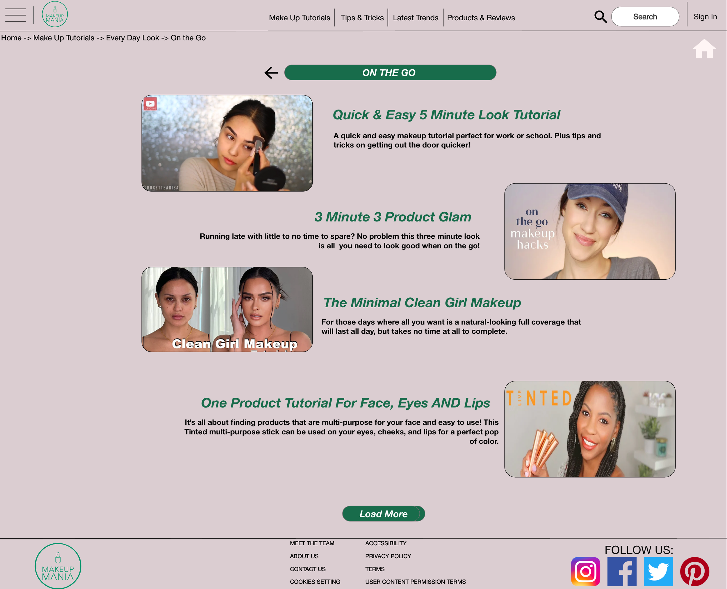
MAKEUP TUTORIAL CATEGORY
Being the main focus of the website, this screen, and its corresponding screens are the ones I spent the majority of my time wireframing. Taking some inspiration from similar websites, I decided to keep this portion of the website as simple and straightforward as possible. Tutorials are split into four main categories - each having its own sub-page, which from there users can distinguish the types of looks they’re looking for that fall within each category. Ranging anywhere from simple looks to intricate trends, users can find almost all types of tutorials throughout the website.
UX Research Study
Once the prototype was set up and complete, I was ready to put this product to test with real potential users and receive their feedback. Though users will be testing the low-fidelity prototype, it is still important to gather feedback from every stage of the process. For me, it was important to confirm that the process to access video makeup tutorials is intuitive enough for users while understanding what difficulties they might face during the process.
Specifically, I wanted to measure the user error rate and conversation rate for my KPIs. The purpose of this study was to confirm users were able to successfully access a simple makeup tutorial video while being able to easily navigate the website. Most importantly, if the user got stuck at any point in the process, I wanted to be able to identify the issue and clear it up for them.
USABILITY TEST
The usability test was unmoderated and consisted of five participants ages 16-52 who range between being beginner, intermediate, and/or advanced with their makeup skills. One participant has a visual impairment while one participant has an auditory impairment. Each session lasted approximately 15 minutes and consisted of the following prompts and follow-ups:
Prompt: Navigate to the Makeup Tutorial page from the home page
Follow up: How easy was this task to complete?
Prompt: Select “Everyday Looks” tutorials
Follow up: How easy was this task to complete?
Prompt: Select the “On The Go” tutorials
Follow up: How easy was this task to complete?
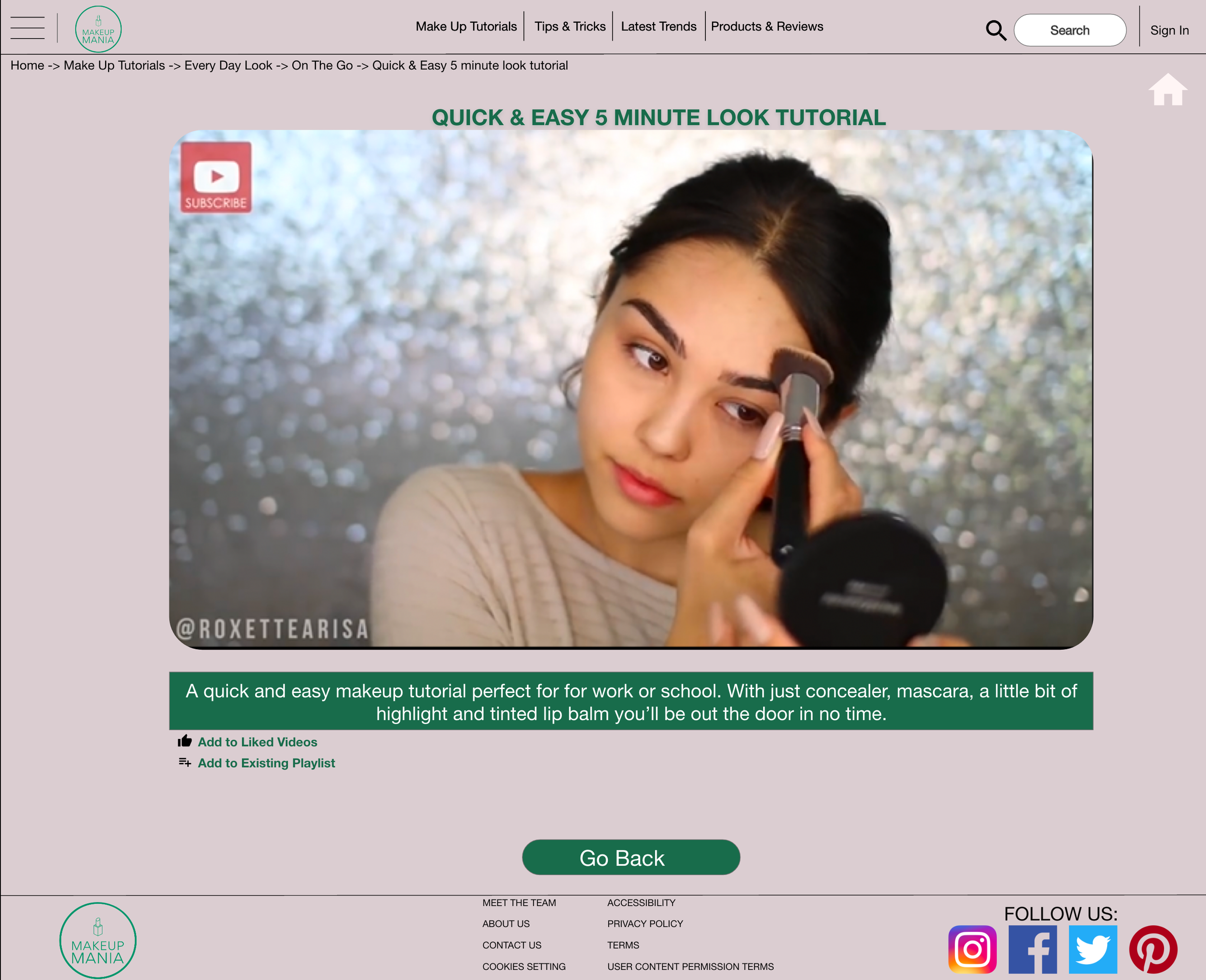
Prompt: Select the “Quick & Easy 5 Minute Makeup Tutorial” video
Follow up: How easy was this task to complete? Did it direct you to the video?
Prompt: Do you see any possible use for this site
Follow up: Would you personally use this website?
Prompt: How do you feel about this website overall?
Follow up: What did you like and dislike about this website?
During the usability test, I took notes down about the participants’ observations and quotes along with how easy or difficult they found each task to be which can be found in the link spreadsheet, which I had created prior to conducting the study.
RESULTS
The majority of the participants spoke in a positive tone while using the website, demonstrating either confidence or curiosity throughout the process. Participants also found the website to be useful, while most said they would use it on a regular basis, two also stated they would also refer to it for looking up the latest trends in beauty - one even saying they would like to receive email notifications from the website with updated trends and celebrity looks.
The navigation throughout the website was well received, most participants were pleased with how straightforward yet informative the website was when it came to providing beauty and makeup content. However, the number of steps to access a video was not. Many participants expressed a desire to have a search option with built-in filters to have the option to quickly search up videos rather than having to navigate within the entire website. Contrary to that, as a whole, participants appreciated the organization of makeup tutorials and how they were categorized within the website, pleased with the consistency throughout the website.
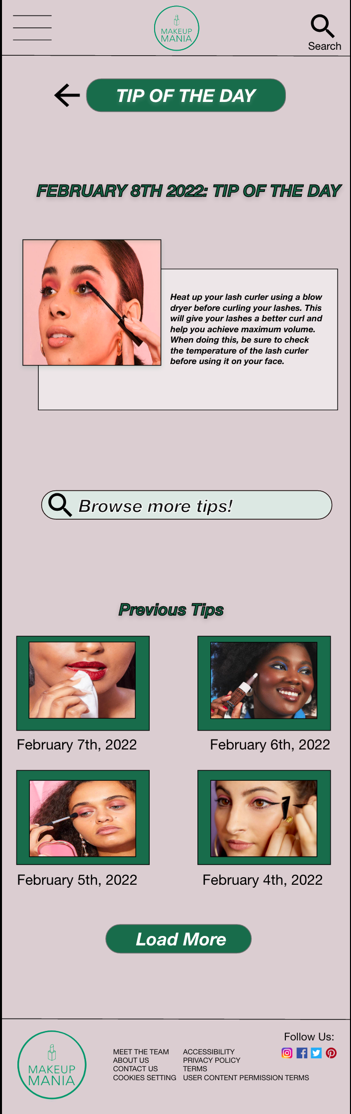
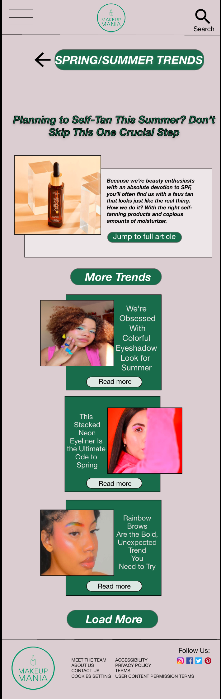
Most of the feedback was received in relation to the overall process within the website. As they went through each step, several participants noted they felt confident after completing each task and were comfortable with navigating between the pages within the website. In addition, all participants did not hold back with providing suggestions and their thoughts for each step during the usability test study. For example, one participant noted it would be nice to have a short description for each video along with adding subtitles to them for more accessibility. While another one mentioned adding other pages such as “Tip of the day” or “Monthly product review” to allow for a more cohesive website for all things beauty and not solely makeup tutorials.
Using the affinity diagram, alongside notes, I had taken allowed me to place all the feedback received into perspective and create the following takeaways from the usability test:
There should be a search bar added for quick access to makeup tutorial videos
The number of tabs on the homepage was the right choice for the website
There should be an option to create an account in order to save videos and trends
Provide an option to receive emails from the website on the latest looks and other beauty related topics
Look into creating a subscription-based feature as provided on similar websites
Provide both short descriptions and subtitles for each video
High-Fidelity Design
Upon receiving feedback from the usability test, I was ready to start working on the high-fidelity design and make changes to the base structure of the design keeping in mind the key takeaways from the usability test. Personally, during this process, the one aspect I wanted to focus on most was the images within the website, especially when it came to products. Of course other aspects such as typography, proportion, and color play key roles in a good design, but for me, it was all about the images.
While completing the competitive audit, I noticed the lack of images provided within each website when it came to mentioning products used in tutorials. While they offered a clear title and price for each product, the websites failed to provide a corresponding image for most of the products reviewed or mentioned. With that in mind, I wanted to ensure my designs included clear photos of each product for users to see as they followed along tutorials or wanted to read up on reviews.
FULL PROCESS TO ACCESS SIMPLEMAKEUP TUTORIALS


In addition to adding images, I decided to use Helvetica Neue as my main font throughout the app and applied features such as font size, boldness, and colors for any accents - such as the title of videos and headings - allowing for consistency. Enhancing the font through size and colors for any accents within the app allows users to not be too surprised or confused by any change when emphasizing sections making them still readable.
In regards to the color scheme, I decided to stick with Makeup Mania, Inc.’s company’s theme, a dusty pink with green accents, keeping both the website and the company consistent and uniform to each other.
CHANGES FROM LOW-FIDELITY WIREFRAMES
While it is clear that the high-fidelity designs look extremely different than the low-fidelity ones, there are also some very specific changes made in response to the feedback received during the usability testing. Resulting in not only a slightly different look but also changing the flow of the prototype providing a more realistic feel to the product.
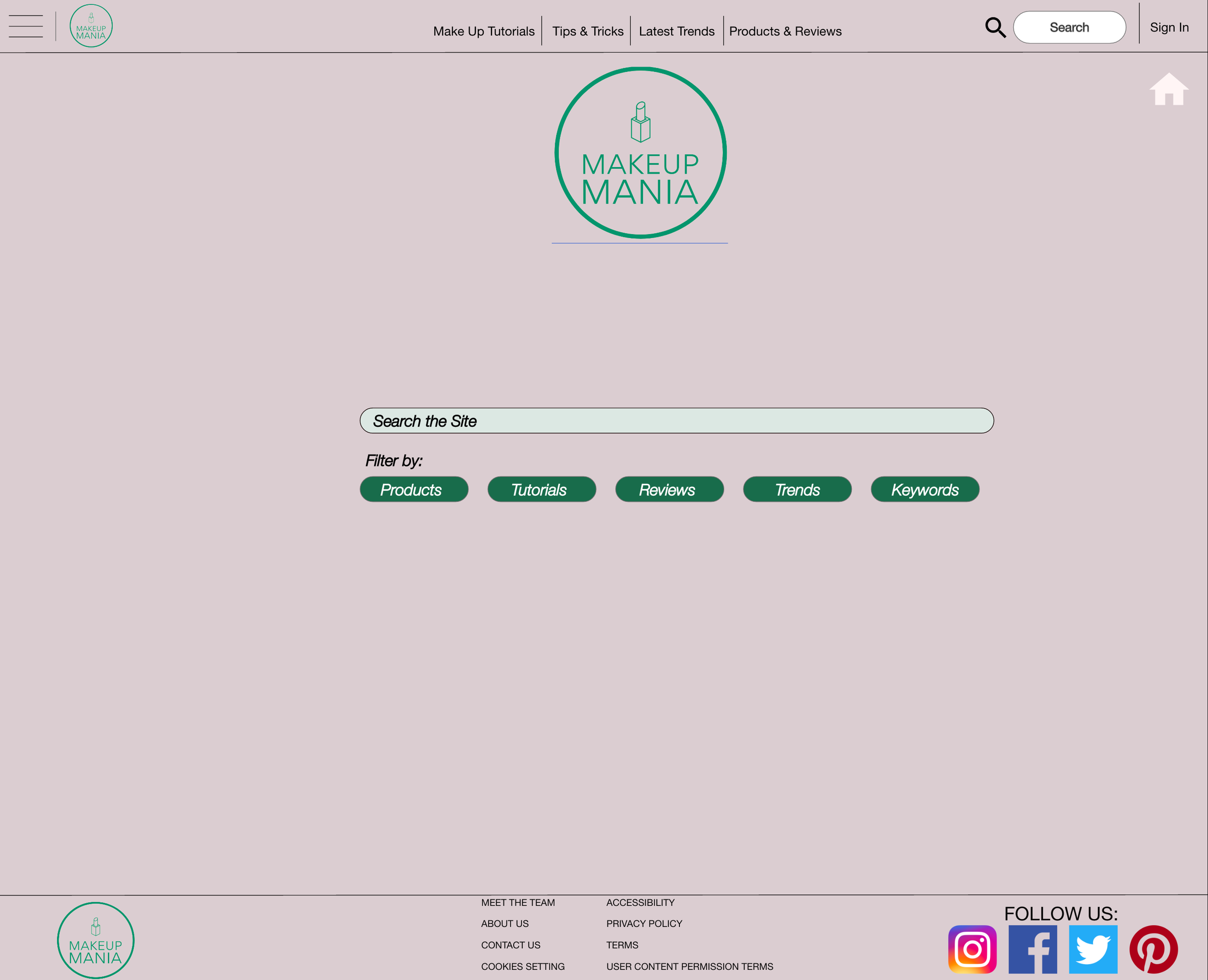
SEARCH FEATURE
The first change was designing a search feature on the website for users to be able to narrow down what they are looking for within the website. In the initial prototype, there was no way for users to be able to do a quick search of trends and/or makeup looks they wanted to see. During the usability test, many participants expressed the want for a quick search when looking up tutorials to avoid having to browse throughout the entire website. This prompted me to create a search tool within the website with built-in filters for users to have a quick and easy way to look up makeup trends, looks, and products without having to endlessly scroll and click throughout the website.
BEFORE USABILITY TEST
AFTER USABILITY TEST
Another change was adding short descriptions to each video in order for users to have an idea of what they are. During the usability test, participants had stated they would prefer if each video had some sort of details or descriptions added in order to distinguish which videos they should watch verse skip when look for certain trends and look. This prompted me to add a quick 1-2 sentence summary which each video to make the users experience much more smoother when using the website,
MOBILE VERSION
in order for a website to be responsive, it must be able to work on all devices, including a mobile. Once I had completed the design website for a desktop device, I began working on designing the responsive website for a mobile device.
The ultimate goal was to implement the designs created for the desktop on the mobile device to ensure both consistency and continuity between the devices for users wanting to switch between the two. Ensuring for a cohesive experience among devices.
takeaway
[theoretical] next steps
What I learned
From initial user research, creating persona and journey map, making competitive audits, designing a low-fidelity prototype for testing then redefining the user experience with high-fidelity designs, the website for Makeup Mania, Inc. has come a long way and is ready for its potential.
In general, most of the reception from the usability study has been positive including countless compliments on the UX, copywriting, and prototype wiring functionality. With that being said, if brought to the real world, the website would be considered useful by majority of people while also helping the overall goal to increase access of the latest beauty and makeup trends to users
Since this project is part of a Google UX Design Certificate program there are no real next steps to be taken. However, if that was not the case, the next step would be to hand this part of the design off to the development team, where they would work on the screens including the logistics within the screens such as account sign-in.
Stakeholders of the company would need to be consulted in order to see how feasible it would be to launch a beauty website that includes makeup tutorials, tips ad tricks as well as the latest trends in a way that is both intuitive and informative
Along with that, secondary action would be taken for the UX design, in which other aspects within the website such as product reviews, subscription features, how-to guides, celebrity trends, along with email notifications would need to be designed and tested to ensure for a smooth user experience throughout the website.
Throughout the design process for this website, I learned how different it is to create a website than a mobile app. Other than the obvious design size, I learned how websites require different features and attention to detail than what a mobile app would. Whether it’s having to create a sitemap or ensuring a linked video on a page works, it’s interesting to learn the different needs in order to provide a smooth experience for users when creating a responsive website.
In addition, I learned about how different users interact within a website compared to a mobile app. With this being my first project creating a responsive website within this program, I was gradually able to see the difference between how users interact when using websites compared to mobile apps and devices. I’ve learned with websites, most if not all, are under the impression to find all the information they need within one never-ending page rather than going back and forth between multiple screens.
Overall, I feel I have started to familiarize myself with the concepts of UX Design through the process of putting together the Makeup Mania, Inc. website, allowing my practice to be versatile, and showcasing my ability to design for multiple devices.