FirstVote Mobile App
FIRSTVOTE App
This proposed mobile application was made to allow first time voters to access information and resources regarding voting in the United States, in attempt to increase voter turner out rates through out the country.
The main flow focus of this project was allowing users to register to vote for upcoming elections. In addition to the design, research was conducted to create user personas, user journeys, and competitive audits while also performing usability studies.
*This project was done as part of the Google UX Design Certificate program and has not been shipped.
project background
As part of the Google UX Design Certificate program, one of project was to design a dedicated mobile app followed by a responsive website that focused on social good. For this project I decided to chose a random prompted from Sharpen, which ended up being “design a way to help first-generation immigrants to get involved with U.S. politics”
As I continue to grow my experience in UX Design, I look forward to getting creative with the process to design this app. However, as any other app design process, it’s important to first better understand the business, competitors, and of course the users.
Background information
Coming from a family of immigrants living in the United States, I decided to select this prompt because I have experienced the difficulties of finding ways to both learn and get involved with politics on a local and national level. Raised by first-generation immigrants, it was hard to find resources and information for things such as how to vote or see who’s currently in office, not only for myself, but also for my parents. Hence making me want to tackle an app that to help first-generation immigrants understand politics within their area.
However, just because I had a few starting opinions about the app - such as providing a guide on how to vote or information regarding policies - that didn’t mean I knew exactly what first-generation immigrants are looking for when wanting to get involved with U.S. politics. After all, each person has a different preference when it comes to being involved in politics.
getting to know the users
Given the opportunity to design an app that focuses on a social good, I decided to conduct a quick research to see what exactly the target users want from such an app. Prior to starting the design process, I went asking first-generation immigrants around me their experience with U.S. politics, how involved they are, along with any difficulties they face when it comes to politics.
After gathering information from the impromptu survey, it was clear that the top common concerns first-generation immigrants had were:
Registering to vote
Understanding how to vote
Figuring out who their elected officials are
After analyzing the main issues I was able to form a general idea of what users are looking for and, with keeping that in mind, I was ready to begin the design process for the app.
For the purpose of this project, you may assume that the register to vote feature is fully functional within the app.
competitive audit
Before starting the design process, I had conducted a competitive audit to better understand similar apps currently on the market and companies behind them. Each of the products that competitors offered was evaluated on their visual design, voting resources, registering to vote feature, and it’s user flow. A few key competitors identified were:
VoterPal - Register Today- US political app identified as a direct competitor. Marketing itself to be very accessible and user friendly, VoterPal - Register Today ensures users are able to easily register themselves to vote within the app. It takes advantage of it’s one page app to provide quick access for users to register to vote with just one tap for a smooth experience.
ActiVote - US political app identified as a direct competitor. ActiVote presents itself to more resourceful app offering key information on all things voting from providing updated information on candidates, policies and how to cast a vote. The ultimate goal of the app is for the user to learn about US politics through interacting within the app by allowing them to take polls on policies and playing games to test their knowledge on US politics.
Help Me Vote - US political app identified as an indirect competitor. Help Me Vote essentially allows users to gain general knowledge on voting and information on candidates running for office. A unique feature offered within the app is short quiz for users to see what candidate their views align with to make their voting process easier.
VoterPal - Register Today is a well-designed app on the surface, it’s primarily for those who are wanting to register themselves to vote making it fairly straightforward. However, due to it being a one page app, it becomes confusing when trying to navigate within the app not realizing it’s only purpose is to register providing no other resources.
ActiVote has the most refreshing approach within the app compared to the other ones, it was much more clear with it’s visual designs providing straightforward text and images while also allowing users to interact with the app. With that being said, I found it useful that it allowed users to learn substantive information about voting and US politics through games and polls. However, it seems a bit tedious to be directed to another app within the app when selecting the option to register to vote.
Help Me Vote seemed to be the least appealing when compared to the rest of the apps. Though it provided clear images and text within its design, it seemed to lack interaction with its users, not having much navigation within the app, the layout of the app didn’t provide a smooth flow at times. At times the screen would either freeze up making it frustrating to complete any of the user flow tasks such as filling out the questionnaire.
My overall take away from the competitive audit in regards to what each of the key competitor app offers are as follows:
Competitor App Strengths Improvements
VoterPal - Register Today - Easy to complete user journey - Extend app to multiple screens for additional resources on voting
- Camera captures clear picture of ID - Offer PDF downloads on voting resources along with registration info
ActiVote - Substantive information provided on voting, candidates & US policies - Add feature to register to vote within app rather than directing to another app
- Interactive user journey with smooth transitions from one task to another - Offer downloadable info provided within app for user to have for future reference
Help Me Vote - Clear images of election candidates and easy navigation - Provide more up to date and relevant information on US politics and voting
- Matches candidates that align with users’ values - Improve questionnaire section by adding more choices for users to select from
user research
The first step to any user searcher process is getting out there and talking to users, which is exactly how I started this project. Prior to diving into the design process I decided to conduct a survey asking first-generation immigrants their experience with US politics at both a local and national level. This allowed me to better understand the challenges they faced with their relationship regarding US politics in order to design an app that can be used in those situations while targeting to solving such challenges. With this in mind, I set out to ask a select group of participants the following questions:
Are you registered to vote? If so, do you participate in local and national elections?
Do you find it difficult to register to vote?
How involved are you and/or your family with US politics?
Are you aware of who your local officials are?
Is there any way you could think of that could increase the rate of first-generation immigrants’ involvement with US politics?
By asking these questions, I was able to easily confirm all selected participants fell into the target audience and found the challenges of getting involved with US politics from several different perspectives. Those who are registered to vote usually do not participate in any US election, locally or nationally, due to the lack of awareness they have when it comes to election dates and deadlines. In fact, most of them did not register themselves rather, had their children and/or younger generation family members assist them when registering. Meanwhile, those who are not registered to vote find the process of registering tedious and complicated. In addition, they were not too familiar with any of their local officials nor their roles in office. Surprisingly, however, the lack of resources was the most prevalent complaint throughout the interviews. First-generation immigrants find it challenging to look for substantive information on voting and US politics. They are often frustrated with the complex language used when reading on topics such as how to vote or US policies, making it less motivating for them to pursue involvement with US politics, whether it’s casting a vote, understanding policies or even volunteering with community events.
While most people interviewed found they would be excited for a mobile app providing resources on U.S. politics and voting, some are deterred from it as they are afraid it might be overwhelming and use complex language making it difficult to understand the resources and information provided. Without the ability to understand the information on their own, first-generation immigrants would not be inclined to using the app and would rather not pursue any interest with US politics than spend time having others explain it to them. Upon the information gathered from the interviews, I divided the selected participants into two primary groups:
PERSONAS
After conducting these interviews, I was able to create personas corresponding to the two groups identified above. Though I had created only two personas to represent each group, there are many more that could have also been created to address other challenges faced by first-generation immigrants with their relationship with U.S. politics.
GROUP #1: People who want to register themselves to vote
These individuals experience difficulties when registering themselves to vote in order to participate in upcoming elections. This group is made up of first-generation immigrant adults (18+) who are all interested in wanting to get involved with US politics through voting. They would like a quick and easy way to register to vote without having to take too much time from their busy schedules to ensure they are eligible when it’s time to vote.
GROUP #2: People who want US politics & voting information through simple language
These individuals experience difficulties when searching for substantive information about voting and US politics. This group varies in age and background, generally being newly American citizens after living in the countries for years with English being their second language. They would like to be able to attain information on how to vote or read up on US policies written in simple terms in order to understand what they are reading to inform and involve themselves with US politics and voting.
PERSONA #1: NEHA BAFNA
Neha is a first generation full-time undergraduate student who works part-time as a sales associate to help pay her way through college. Between classes and work she finds it hard to make time to register to vote in order to participate in her first election. She wants to be as involved in local and national elections while also help register her family members to also vote and get involved.
“It’s so hard finding time to figure out how to register to vote, I wish I could just tap my way to register.”
From this we can determine that Neha lives a busy life and needs to be able register to vote in a quick and efficient way.
PERSONA #2: NAOMI GONZALES
Naomi is a medical receptionist who immigrated to the United States from Colombia at the age of 23 with her husband and recently became a citizen. She is excited to finally be able to participate in voting but finds it difficult to understand how voting works when searching about it online. She wishes there was a website that could provide all the information about voting in simple language.
“I am so excited to vote, but i wish there was a platform to get information about voting without having to read through so much”
From this we can determine that as new US citizen, Naomi needs to able to understand how to register herself to vote with instructions that are easy to follow.
USER JOURNEY MAPS
While persona’s and user stories allow to empathize with the user, it’s difficult to truly understand their challenges unless one experiences them first hand - thus making user journey maps a a vital process for user research. By creating user journey maps for each persona, I was able to pinpoint possible issues needed to be brought up to the design team to discuss. For this specific application I created a user journey map for Neha and Naomi under the assumption that they registered to vote using a competitor application.
Neha’s User Journey
Neha’s journey starts with downloading the app to her phone and creating an account from the home screen. Though she wished she didn’t have to create an account before being able to proceed within the app, she navigates through the app and lands on the register to vote section. Hoping there was a quicker way to get to the section, she fills out and submits the form to register. Once registered she decides to subscribe for upcoming election dates and shares the app with the rest of her family members to also register themselves to vote. For this user journey, the following improvement opportunities were identified:
Provide option to opt out from creating an account
Allow user to browse app features from home screen
Provide filters to narrow down search time within the app
Provide external links with information on voting after user completes form
Naomi’s User Journey
Naomi’s journey begins with opening the app within her phone to the home screen. From there she begins browsing through the app with hopes of being able to find information on voting, including how to register. After exploring the app she was able to narrow down her search and found information on voting along with other topics, she was pleased to see they were all provided with simple language terminology. She then creates an account and registers herself to vote for the upcoming election by following the instructions provided within the app. Thought excited to be able to register, she wished there was a way for her to save the information within the app to her phone and curious to see if there was a desktop version of the app as she usually uses her laptop more than her phone on a daily basis. For this user journey, the following improvement opportunities where identified:
Provide downloadable PDFs of information found within app
Provide bookmarks to organize certain information user wants to reference later
Offer a desktop version of the app for alternative accessibility
Offer options on types of emails liked to be received
low-fidelity design
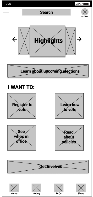
Initially, I wanted to design the app to follow a sequence of events best suited for its users. When first opening the app, naturally users would land on the home screen where they are presented with the various resources they are looking for in regards to voting and politics. However, with the main focus of this app being the ability to register to vote, I knew I wanted the flow for the prototype to include the process of them being able to register to vote.
Explanations of each individual screen designs follow below.
TOP BAR & NAVIGATION
Wanting to keep the app as simple as possible, the top bar and navigation remain fairly straight forward and consistent through out the entire app experience.
The top bar shows only the name of the screen the user is currently on along with buttons that go backward in process or to close out of something.
The navigation for this app located along the bottom only has four items that fit easily with the flow of the app. Though only the home and register to vote have wireframed main screens in this example, each navigation item is expected to be functional from any screen.
HOME
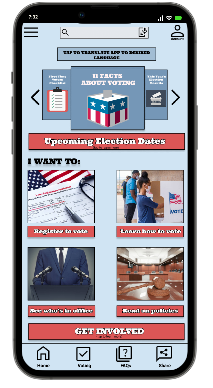
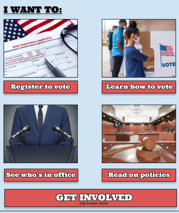
The home screen is the first screen users land on when opening the app. Finding that similar apps tend to have too many topics and resources jumbled with an endless scroll, I wanted to utilize this page to display only the main resources users are looking for within the app. The design allows to highlight resources users most look for in the center of the app while having clear call to actions underneath and above them allowing users to get involved and read articles about current political events.
While there are no call-to-actions on the main screen of the homepage itself, each feature section would bring up a screen with more information and links corresponding to each topic.
REGISTER TO VOTE
Being the main focus of this app, these screens were the ones I spent majority of my time thinking about and wireframing out on paper before taking digital. Rather than taking inspiration from the competitors, I decided to design the screens from scratch, creating layouts allowing for a smooth user flow experience. The feature Register to Vote is located on the home screen for easy access, which directs users to the process once selected from the screen. From there a series of screens will allow the user to flow through each step of the registration ultimately leading to the complete screen.
REGISTRATION PROCESS
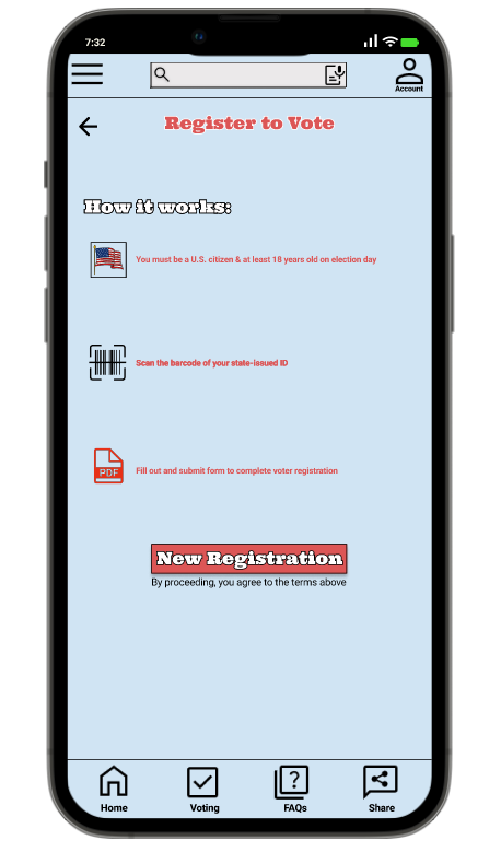
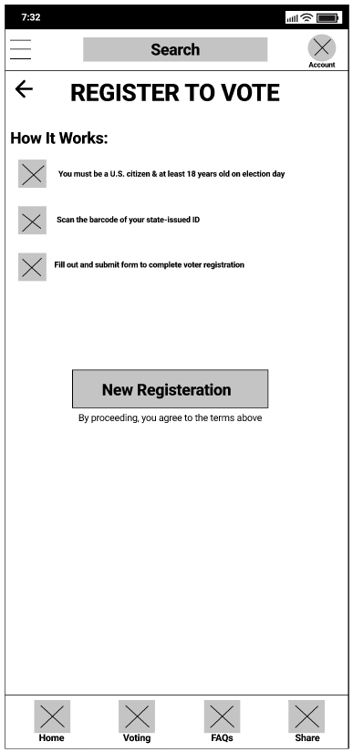
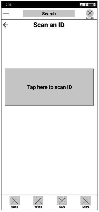
Once users select “Register to Vote” from the home screen, they are directed towards the first screen which provides instructions on how the process to registering themselves to vote works. Once they select “New Registration” they will be prompted to the next screen allowing them to start the first step in completing the activity.
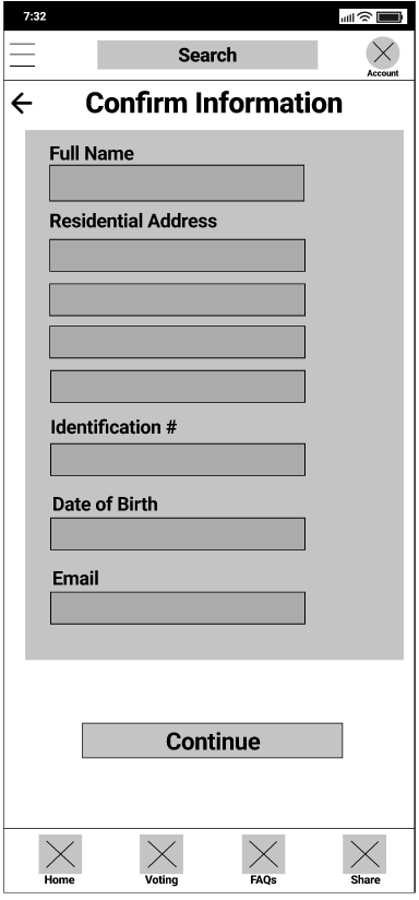
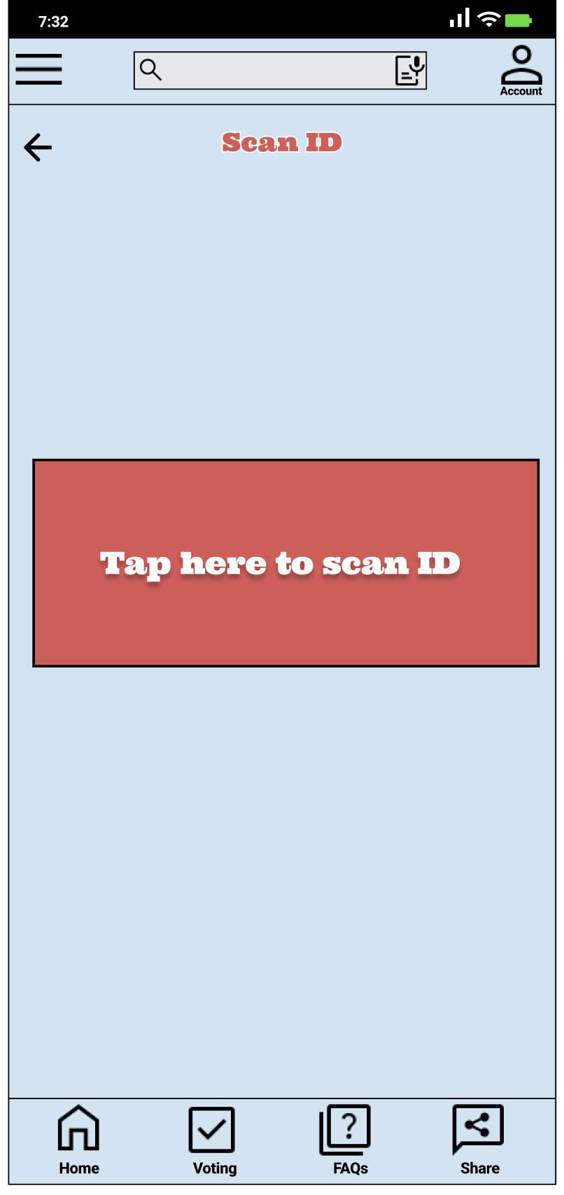
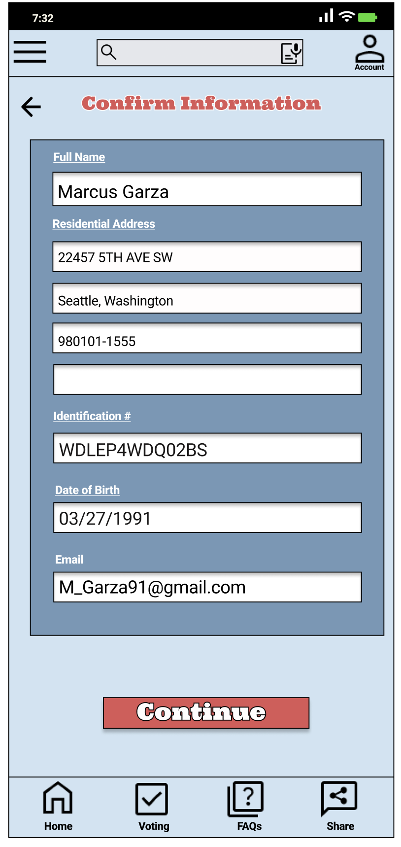
The first actual step for users to register is to scan their state ID in order for the app to capture both their residential and personal information. Once captured users will be directed to the Confirmation screen where they can either confirm the information captured is correct or manually edit the information as needed before moving on to the next step. This allows the app to capture accurate information about the user to ensure proper registration for them.
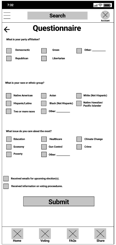
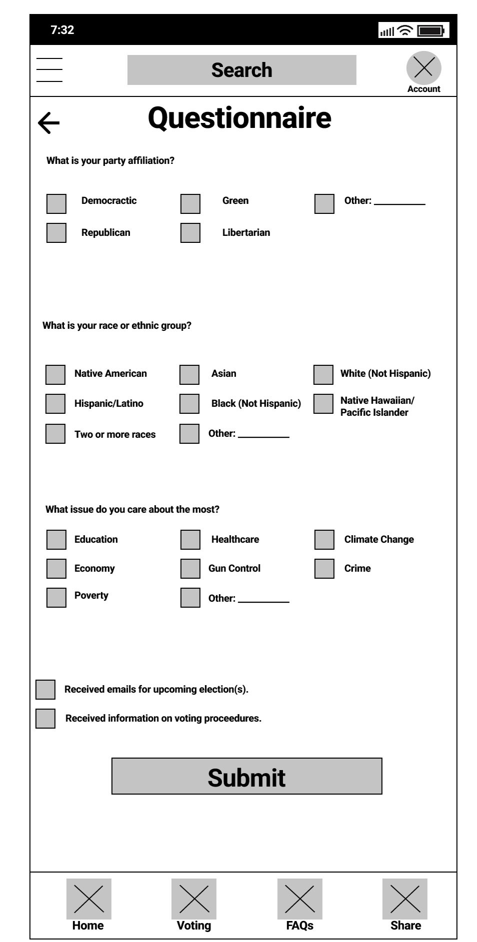
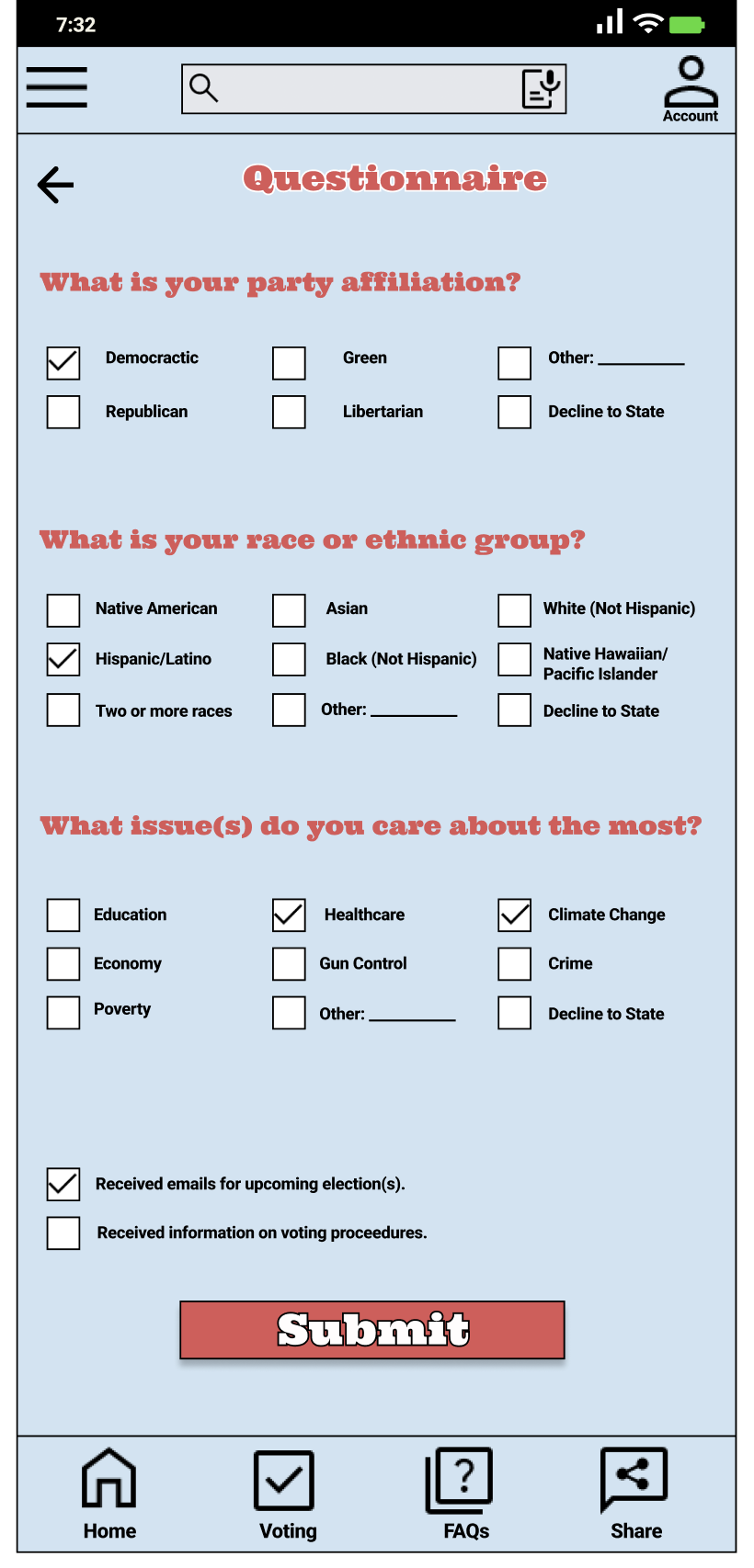
Once the information has been confirmed, the next screen users will see is the Questionnaire where they pick answers to a few questions focused on their political interest and background. This screen also provides them to pick the option to receive emails for both incoming elections and information regarding voting procedures. By completing this portion of the registration, users are able to receive relevant information allowing them to be informed while having an interest towards getting involved with U.S. politics.
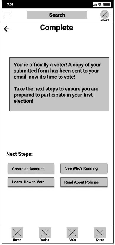
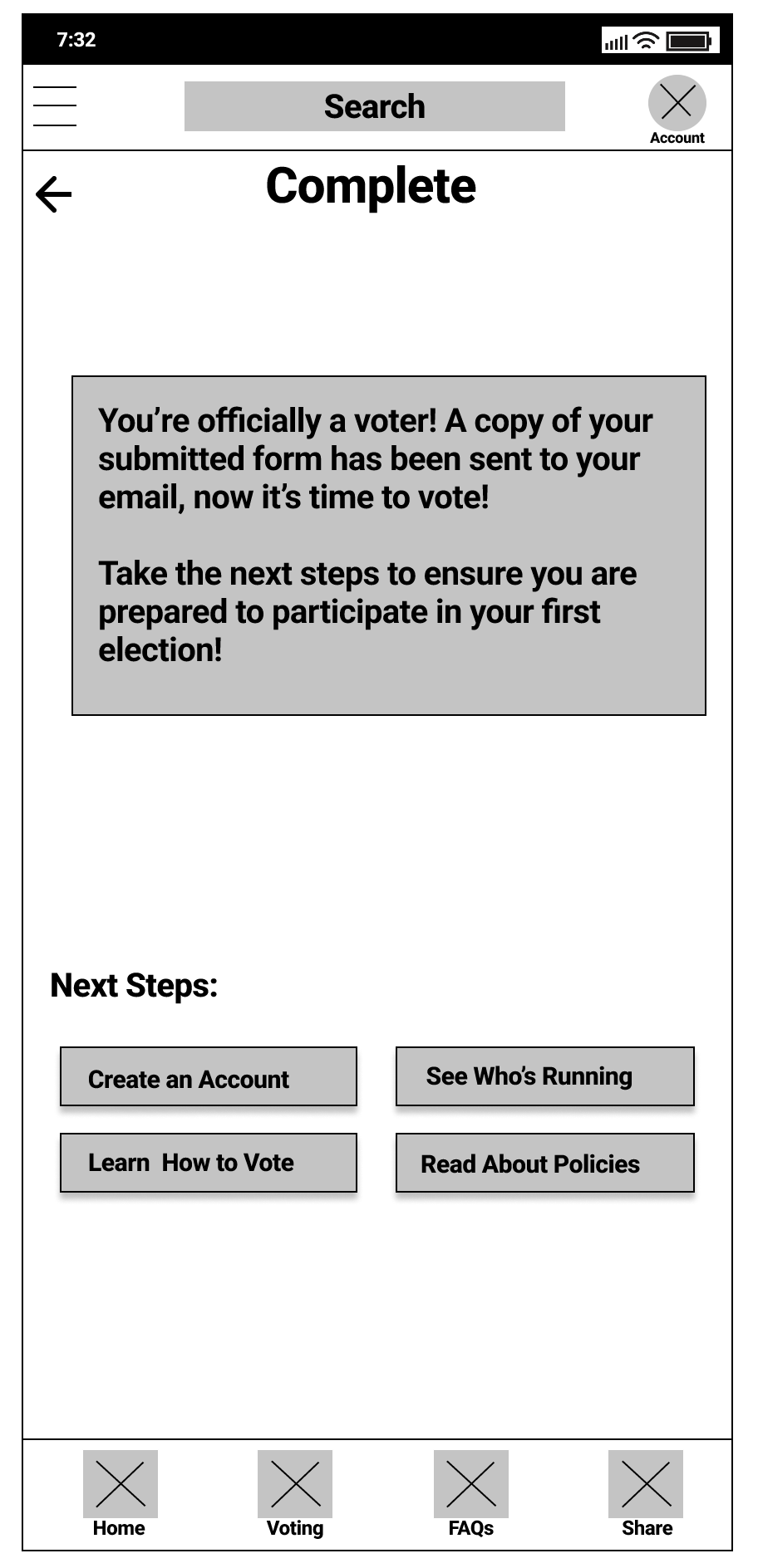
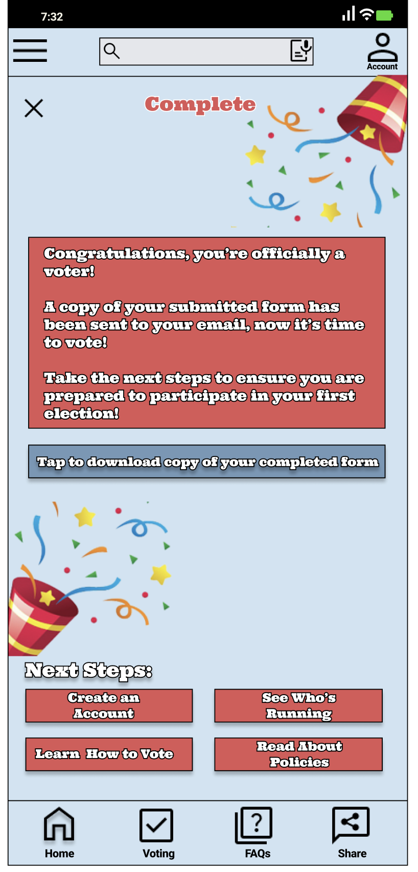
After submitting the questionnaire users are finally directed to the Complete screen indicating that their registration has been completed and they can official vote. This screen informs users that a PDF copy of their registration form has been sent to the email provided along with provided links to other features within the app such as creating an account, learning how to vote or reading about policies allowing users to access additional resources within the app.
ux research study
Once the prototype for the low-fidelity design was ready to go, I was confident to put this product to the test with actual potential user and receive their feedback. Though users typically test and provide feedback from high-fidelity prototypes, it is important as a UX researcher to gather feedback from every stage of the process. Personally, it was important to confirm that the process of registering to vote was intuitive enough for users while understand what difficulties they might face during the process.
For this project, I specifically wanted to measure user error rates and conversation rates for my KPIs. By conducting this study, I wanted to confirm users were able to successfully register themselves to vote but most importantly I wanted to be able to identify and clear any issues users have if they get stuck at any point of the process.
USABILITY TEST
The usability test was unmoderated and consisted of 5 participants ages 18-52 who want to register themselves to vote. One participate considers English as their second language and another is a newly American citizen. Each session lasted approximately 10 minutes and consisted of the following prompts and follow-ups:
Prompt 1: Select Register to Vote option from home screen
Follow-up: How easy or difficult was this task to complete? Were you able to easily navigate to the tab within the home screen?Promote 2: Select “new registration”
Prompt 3: Tap to scan ID
Prompt 4: Place ID under the rear-facing camera to capture information
Follow-up: How easy or difficult was this task to complete? Were you able to scan the ID properly?Prompt 5: Confirm scanned information from ID
Follow-up: Was the scan able to capture the information accurately?Prompt 6: Complete questionnaire and submit registration for voting
Follow-up: Did you find the questionnaire useful? Why or why not?Prompt 7: How did you feel about this application overall?
Follow-up: Can you tell me what you like and dislike about this application?
During the usability test, I took notes down about the participants’ observation along the way which can be found in the linked spreadsheet.
RESULTS
Majority of the participants spoke in a positive tune while using the application, demonstrating either confidence or curiosity throughout the process. Participants also found the app to be useful, while most said they would consider it to be a good resource for voting education and registration.
Most of the feedback was received in relation to the overall registration process within the app. As participants went through the process, several of them expressed confusion when they went to scan their ID. While some had to manually make changes to their information after scanning their ID, others found that scanned ID had captured their information accurately. Despite having the app sending them a copy of their registration form to their email, participants questioned if there was a way for them to access the form within the app once completing the process, some even asked for a direct PDF copy to save on their phones.
The overall navigation within the app was well-received, including the Register to Vote feature. As a whole, participants expressed feeling comfortable when navigating with the home screen to access the registration feature. Contrary to that, the Questionnaire screen seemed to be the least liked by participants as they wondered if they could either skip it or had the option to decline to state an answer.
With the affinity diagram and my notes, I was able to place all the feedback into perspective, creating the following takeaways from the usability test:
The complete screen needs a slight redesign with an option to download a copy of the form within the app
Rather than enforcing the questionnaire, it should be seen as an optional step in the process
The home navigation was a correct choice for this app
The instructions screen provides clear and coherent directions in completing the registration process
high-fidelity design
Upon receiving feedback from the usability test, I was ready to start working on the high-fidelity design, implementing changes to the base structure by keeping in mind the key takeaways from the usability test. Personally, during this process, I wanted to focus on primarily the typography within the app. Of course other aspects such as images, proportion, and color play key roles in good design, but for me, it was all about the typography.
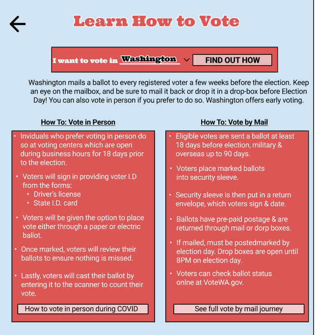
While completing the competitive audit, I noticed the majority of the apps would use complex language when explaining the simplest terms and procedures. Whether it was explaining how to vote or describing U.S. policies - the apps used words difficult to understand making it harder to comprehend what is being read by users. With that in mind, I wanted to ensure my designs included simple words and a straightforward approach when providing both information and instructions.
In addition, I decided to use Ultra as my main font throughout the app, applying features such as font size, boldness, and colors for accents such as bolding the headings and important information allowing for consistency. Enhancing the font through size and colors for accent within the app allows users to not be too confused with any change when emphasizing sections while being readable.
For the color scheme, I wanted to stick with the traditional red, white, and blue by enhancing the shades of the colors to make them pleasing to the users’ eyes.
In order for the app to feel welcoming to users, I decided to utilize the home screen by implementing the first-person narrative. By adding “I want to:” when selecting the resource, users are able to connect with the app by feeling it is personalized and made for their specific needs.
Along with the first-person narrative, I ensured to provide information in a way that was easy for users to comprehend when attaining it through the app. Using simple words and language when explaining how to vote while being as thorough as possible allows users to understand what they are reading easily.
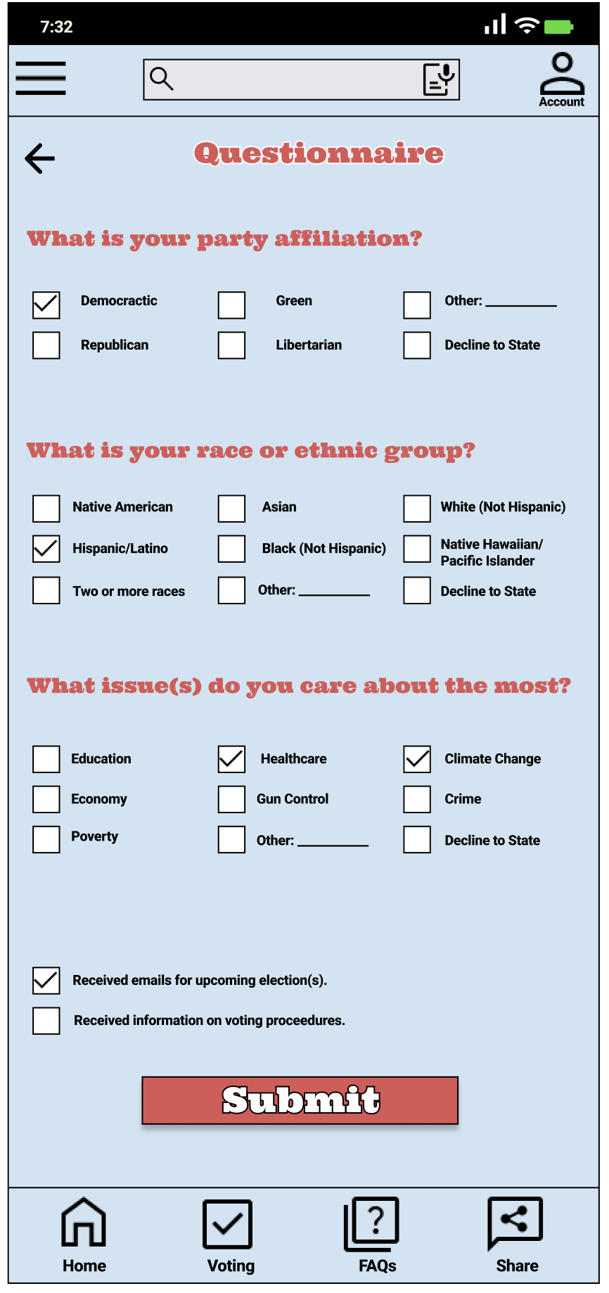
While it is clear that the high-fidelity designs look extremely different than the low-fidelity ones, there are also some very specific changes made in response to the feedback received during the usability testing. Resulting in not only a slightly different look but also changing the flow of the prototype providing a more realistic feel to the product.
QUESTIONNAIRE
The first change was adding the choice “decline to state” for each question in the Questionnaire. Before, users didn’t have the option to opt-out from providing answers when landing on the Questionnaire screen. During the usability study, this made many participants frustrated wanting to be able to skip this part of the registration process. This prompted me to add the option to decline for those who wished not to provide information or to opt-out from having to provide any answers to any of the questions.
COMPLETE SCREEN
Another change was adding the feature to download a PDF copy of the completed registration form once a user completes the process. Prior to this feature, users received their completed forms to their emails. During the usability test, many participants expressed their desire to access their completed form as soon as they complete the registration process. Prompting me to add the feature to download the form within the app once a user completes it.
FULL REGISTRATION PROCESS
Responsive Design
In order for the app to be accessible, it’s important that it has a responsive design for users to access it through various devices.
Once I had completed the design app for a mobile device, I began working on designing the responsive website. The ultimate goal was to implement the designs created for the mobile app on the website to ensure both consistency and continuity between the devices for users wanting to switch between the two.
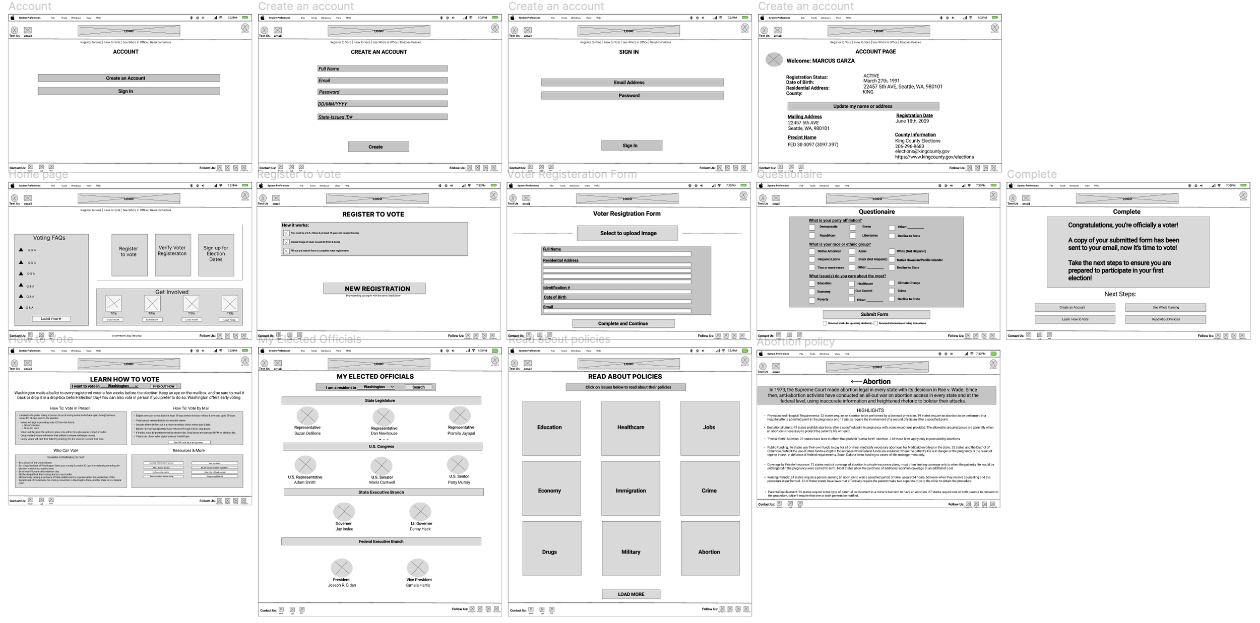
I used the hierarchical sitemap to guide the organizational structure of each screen’s design to ensure a cohesive & consistent experience among devices.
DESIGN PROCESS
Similar to the mobile app process, after creating the sitemap, I began designing the low-fidelity prototype followed by the high-fidelity prototype. Keeping in mind the feedback from the usability test, I based a majority of the design aspect to ensure the users had the same smooth process registering on the website as they did when registering through the mobile app while adding certain features that are best fit for websites.
Low-Fidelity Design
High-Fidelity Design
takeaway
From initial user research, creating personas and journey maps, making competitive audits, designing a low-fidelity prototype for testing then redefining the user experience with high-fidelity designs, the FirstVote app has come a long way and is ready for its potential.
In general, most of the reception from the usability study has been positive including countless compliments on the UX, copywriting, and prototype wiring functionality. With that being said, if brought to the real world, the app would be considered useful by majority of people while also helping the overall goal to increase the involvement of first-generation immigrants in U.S. politics including an increase in voter turnout.
[Theoretical] Next Steps
what i learned
As this project is part of a Google UX Design Certificate program there are no real next steps to be taken. However, if that was not the case, the next step would be to hand this part of the design off to the development team, where they would work on the screens including the logistics within the screens such as scanning IDs.
Along with that, secondary action would be taken for the UX design, in which other aspects within the app such as candidate information, links to external resources, account sign in along with email notifications would need to be designed and tested to ensure a smooth user experience throughout the app.
In addition, to ensure the responsive website aligns with the mobile app I would begin the design process as I did for the mobile app including conducting a competitive audit, user research, and of course usability tests. Guaranteeing users have the same experience whether they decide to use the mobile app or the responsive website.
Throughout the design process for this mobile app, I learned that the initial ideas are only the start of creating it. As I continue with usability studies and peer feedback influencing each iteration of the app’s design I can only improve the user experience with each update and add-on features.
I learned that even though my main focus was ensuring first-time voters had access to registering to vote, by diligently going through each step of the design process and aligning with specific user needs, helped me come up with additional voter resources for users that were both useful and easy to comprehend for both who are new to voting as well as first-generation immigrants wanting to get involved with U.S. politics.
Overall, I feel I have started to familiarize myself with the concepts of UX Design through the process of putting together apps within the Certificate Program, and hope to only improve as I continue to take on more projects.
