movie theater snack app for galaxy theater
Movie Theater Snack App
This proposed mobile application was made for a fictional movie theater Galaxy Theater, in an attempt to raise sales of the theater’s snacks to movie-goers.
The main flow focus of this project was adding snacks to a user’s cart and checking out. In addition to the design, research was conducted to create user personas, user journeys, and competitive audits while also performing usability studies.
*This project was done as part of the Google UX Design Certificate program and has not been shipped.

Project Background
In 2022, I decided to enroll in the Google UX Design Certificate program, which allows beginners and advanced designers alike to walk through the process of UX design from initial user research down to usability tests and even hand-off to developers. As part of the program’s coursework, I chose a random prompt from Sharpen, which ended up being “design a snack ordering app for a movie theater”
As someone who enjoys the creative process, I was looking forward to getting into the design of the app, however, there were many much-needed steps to be taken first in order to help me understand the business, competitors, and most importantly the users.
Business Research
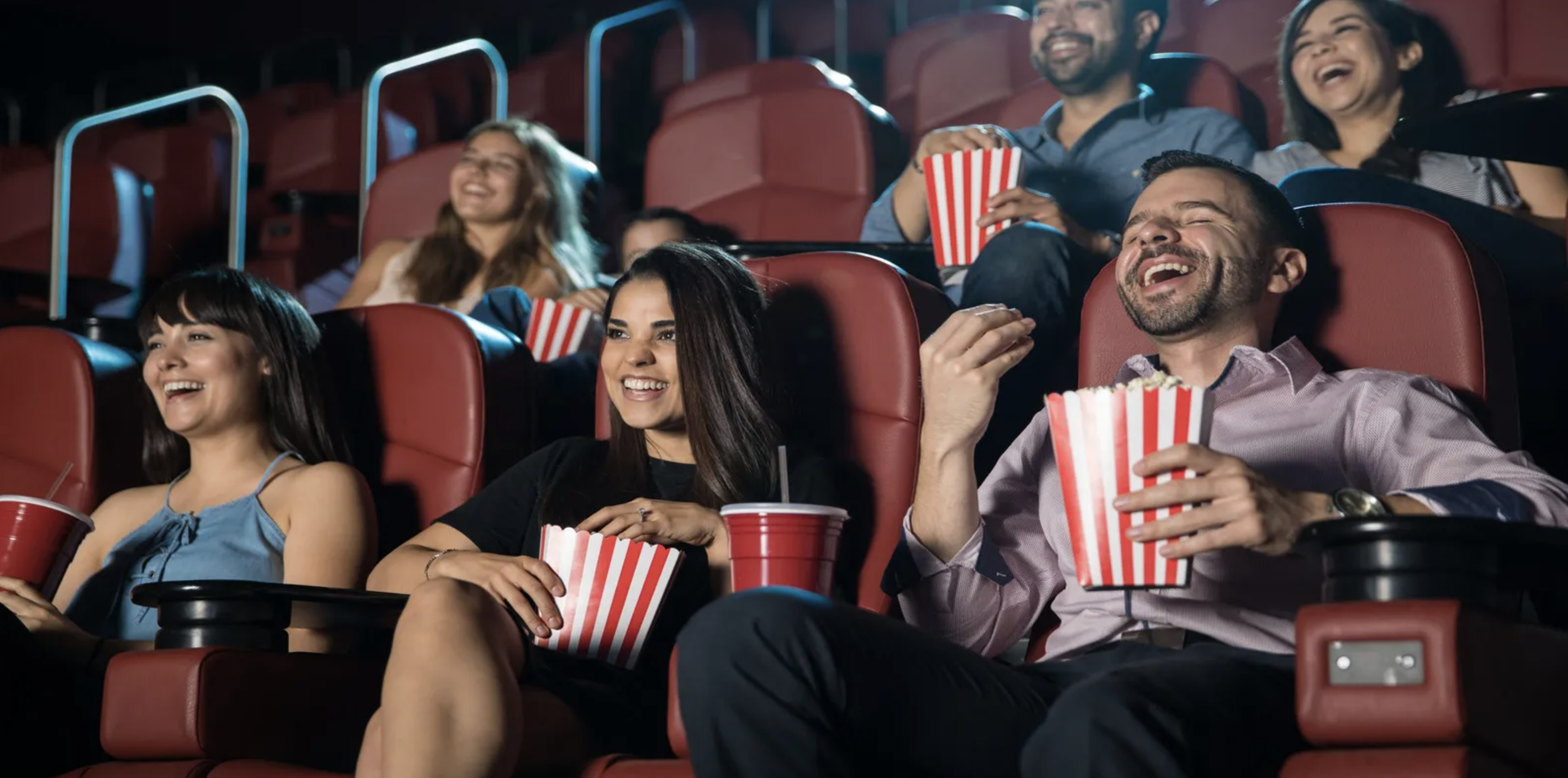
As an avid movie-goer, I decided to select this prompt because I always find myself buying snacks every time I go to the movie theater and think of myself as rather a movie theater candy connoisseur. In addition, I use a couple of food order apps, perhaps more than any other apps on my phone hence felt confident I could tackle a snack ordering app for a movie theater.
However, just because I had some starting opinions about the app - such as getting snacks delivered right to your seats or requesting snacks ahead of time - that didn’t mean I knew exactly what other companies were doing….After all, I hadn’t been outside my house - much less to a movie theater - in nearly over a year.
getting to know the business
Wanting the opportunity to come up with my own branding rather than borrowing existing concepts, I decided to create a fictional company called Galaxy Theater to be the client for this application. Galaxy Theater is a small town movie theater where people come to experience all genres of movies allowing them to escape their reality for a few hours. Similar to most movie theaters, they also offer snacks and a rewards program for frequent movie-goers.
When it comes to purchasing snacks, a lot of money goes into it but unfortunately, there is no significant return on investment in this part of the business. Often customers complain about the wait being too long or not wanting to miss the movie if wanting a snack halfway through it. Keeping this in mind, the Galaxy Theater business decided it could be worth exploring a mobile app to solve the problem. The goal was that this mobile app would allow accommodating actions such as purchasing tickets and logging into an account, but would primarily focus on the sales of snacks for the prototype. Snacks are to be laid out in a way making it easy for customers to see exactly what was available allowing for convenient customizations that made ordering snacks in the app more enticing rather than standing at the counter.
For the purpose of this project, you may assume that Galaxy Theater has assigned seating for each movie along with a dedicated pick-up station for orders placed through the mobile app.
Competitive Audit
To better understand similar apps currently on the market and the companies behind them, a competitive audit was conducted. Each of the products that competitors offered was evaluated on their visual design, ordering process, payment process, delivery & pick-up process along with ease of use. The key competitors identified were:
Cinemark - a US-based movie theater company identified as a direct competitor. Marking itself as being very accessible and open, Cinemark trusts its customers to know what they want and make their own decisions, offering all their items in a clear and open matter. It takes advantage of its assigned seating to provide unique experiences for their clientele such as item delivery to their seat.
AMC Theaters - a US-based movie theater company identified as a direct competitor. AMC Theaters presents itself to be more casual and laid-back, primarily located alongside amusement parks and tourist attractions. Their goal is to be equally as fun as the places around them offering experiences such as “to-go popcorn” and icee machine.
Regal Entertainment - a US-based movie theater identified as a direct competitor. Regal tries to more of a higher-end cinema offering a Crown Club and referring to their customers as royalty. The popcorn tends to be fresher than that of their competitors and they know it. Their marking efforts demonstrate their products are of top quality.
HOYTS - an Austrailan and New Zealand-based movie theater company identified as an indirect competitor due to their locations. HOYTS markets itself to be a fun stop along the way for customers if they want to see a movie or have a good time with friends and family. Due to my lack of familiarity with this brand in comparison to others, I did not have previous in-house experience to draw from - possibly altering the report slightly.
Cinemark is a well-designed app on the surface, for those who go in already knowing what they want, the interface is straightforward. However, if you decide to change your mind mid-way through the purchase process, it becomes difficult to use. In regards to snack ordering, this app had the most variety of snack options along with the ability to customization and was also the easiest when it came to navigating the payment screen.
Both Regal and AMC use the same white-label solution for mobile ordering, making their comparisons nearly identical. With that being said, I had an easier time finding the snack ordering option on the AMC app but both apps delivered a sub-par experience when it came to customizing the snack items. Categories were simple images, with each item being in a list format. Along with no customization options, it was difficult to locate the payment options when checking out.
HOYTS had a more refreshing approach within the app compared to the other apps, it was much clear on how to select options and proceed forward. It also offered the best overall experience, however, when it came to the order process specifically, there was a disconnect between the payment and pick-up options. Making it unclear whether you were ordering in advance or just holding your place in line.
My overall takeaways from the competitive audit for each of the snack ordering mobile app products offered are as follows:
Movie Theater Strengths Improvements
Cinemark - Uses branding throughout the application - Offer ways to navigate to cart without having to start the process from beginning
- Easy to navigate, select and view categories and items - Confirm back and close buttons work in all parts of the application
AMC Theaters - Easy to navigate snack options - Offer more accessible ways to view menu items
- Clear to see items added to cart and total cost - Provide native app functionality for drop down menus
Regal Theaters - Appealing visual notifications that draw your attention - Offer more accessible ways to view menu items
- Clear to see items added to cart and total cost - Limit use of snack images to ordering snacks & avoid promoting reward card/signups
HOYTS - Visually stands out from crowd like apps - Make error messages clear
- Smooth, easy and clean interface compared to other apps - Offer dark mode for customers with visual impairments or those in the theater
User Research
In any user research process, the first step is getting out there and talking to users, and this project was no exception. Prior to going into any interview, I knew my goals were to understand the challenges associated with ordering snacks at the movie theater and in which situations users would prefer using mobile order vs. ordering at the counter. Thus allowing me to design an app that can be used in those situations while targeting to solve such challenges. With this in mind, I set out to ask a select group of participants the following questions:
How often do you go to the movie theater?
How many people do you typically go with?
What snacks, if any, do you take with you into the movies?
What do you tend to like or dislike about ordering snacks at the movies?
Is there any way you could think of to improve the process?
By asking these questions, I was easily able to confirm all selected participants fell into the target audience and found the challenges of ordering snacks at the theater from several different perspectives. Those who go to the theaters by themselves or with others who are unable to carry items usually don’t get as many snacks as they would like or even get any at all due to there being no good way to get them from the counter to the actual theater. In addition, they are willing to skip the movie when wanting refills. Surprisingly, however, waiting in line was the most prevalent complaint throughout the interviews. People find it a challenge to wait in line with larger groups or small children, worried they’re going to run late for the movie. Some find it frustrating when the line itself is empty but are stuck waiting for a cashier to ring them up.
While most people interviewed found they would be fans of mobile ordering, some are deterred from it as they like to make special requests such as adding excessive amounts of butter in their popcorn or wanting a “half-and-half” style drink. Without having a good way to specify these requests, they would not be inclined to using the app and would rather go without snacks than have them made incorrectly. Upon the information gathered from the interviews, I divided the selected participants into two primary groups:
GROUP #1: People who attend the movies alone or with 1-2 people
These individuals experience difficulties trying to get up from movies for refills or additional snacks. This group is made up of established adults (21+) who are all in various points of life with small families. They would like to see an application which can be used while watching a movie without disturbing anyone and that properly display all the snacks offered within the theater.
GROUP #2: People who attend movies in larger friend groups or family (4+ people)
These individuals experience difficulties going to the theater on time when everyone would like snacks. This group varies in both age and backgrounds while tending to be more extroverted with either their big group of friends or family. They would like to see an application that can be used to place large snack orders prior to arriving at the movies that also have options such as group ordering or paying at the counter.
PERSONAS
Conducting these interviews allowed me to create a persona that fell into each of the two groups identified above. Though there are only two personas to represent each group, there are many more that could have also been created to address other aspects of the snack ordering process.
PERSONA #1: Layla Adams
Layla is a software engineer for a startup company who is engaged to her fiance of two years and they enjoy going to watch any new comedy movies that come out. Both love eating popcorn during the movie but her fiance will eat most of it during the previews causing her to get up during the movie to get a refill. This causes her to often miss significant points of the movie due to long lines.
“I love a good joke but what’s the point of laughing if it has to be explained to me? I hate having to ask my fiance what I missed when coming back with my refill”
From this we can determine that Layla is comedy movie fanatic who needs to be able to quickly refill her popcorn because she does not like to miss out on any jokes of a comedy movie.
PERSONA #2: Sebastian Bach
Sebastian is a father to 7 year old twin boys who enjoy catching the latest animated movies. They love to pick out various snacks before entering the theater room. Sebastian enjoys watching the previews but his kids take too much time deciding on snacks causing them to miss the previews and sometimes even the beginning of the movie.
“I worry my kids spend too much time picking their snacks causing us to miss parts of the movie and previews. It’s difficult to narrow down the choices for my kids due to the theater having endless options”
From this we can determine that Sebastian, a father of two, needs to be able to pre-order snacks for the movies because he wants to avoid missing any previews.
USER JOURNEY MAPS
While personas and user stories allow to empathize with the user, it’s difficult to have a true understanding of their challenges unless one walks a mile in their shoes. Thus, the user journey becomes an important aspect of that. With the user journey maps I was able to pinpoint issues that may need to brought up to other teams, especially when there is an in-person component within the process that the design team has no control over. For this application, I created a user journey map for each of my personas under the assumption that they ordered at a competitor with a similar application.
Layla’s User Journey
Layla’s journey starts with ordering popcorn in person prior to the movie starting. Though it goes smoothly, she notices half of her popcorn was finished and wishes to get more to snack on throughout the movie. Remembering about the app, Layla decides to place her order through the app but pick it up in person. During the process, she can’t help but notice there is no way for her to apply reward points as she could if placing the order over the counter. While she is happy she doesn’t have to wait in line, she is worried she might miss a significant part of the movie while she gets up to pick up the popcorn but is thankful to have her fiance explain anything she missed. For this user journey, the following improvement opportunities were identified:
Signage should be placed around theater to promote app or have employees mention it to customers
Cashier should confirm if customer would like a larger size popcorn
Doors should be push-to-open in order to accommodate people carrying snack
The app should offer ways to connect rewards points for regular customers
A delivery service should be created to bring orders directly to seats
Sebastian’s User Journey
Sebastian’s journey begins with downloading the app in hopes it will improve his movie theater experience with his sons. He is able to add his selection to the cart but still found his sons spending a long time picking snacks within the app. Pleased he is able to place his order for pick-up with the option to pay at the counter he however finds customer service lacking once he arrives at the theater. Due to the theater being understaffed, he still has to wait at the counter just as long as he would have if ordering in person. While he does eventually receive his order, he wonders if he should have just waited in line and let his sons pick their snacks at the theater. For this user journey, the following improvement opportunities were identified:
Offer a bonus or discount for first-time users
Add features to filter snacks based on people’s preferences and categories
Create a favorites list to narrow down choices to place orders efficiently
Allow selection for pick-up time in advance of final order confirmation
Have dedicated staff at pick-up area to handle in-person payments
While many opportunities identified in both situations had more to do with the theater, rather the app, I believe it is still the designer’s job to make the process as smooth and pain-free as possible. An easy order process along with clear communication within the app makes it easier for people to decide to trust a delivery service or forgive a busy night behind the counter. Note: in a real-world situation opportunities such as staffing concerns would be brought to the appropriate team to rectify in conjunction of the app launching.
low-fidelity design
For the initial design, I wanted to follow a sequence of events that would make sense in the app. When someone first opens the app, naturally they would see home screen with featured movie first as this is what drives most individuals to the theater. However, the main focus of this app being the snack ordering process, I knew the flow I would design for the prototype would include adding snacks to the cart and completing the checkout process.
Explanations of individual screen designs follow below.
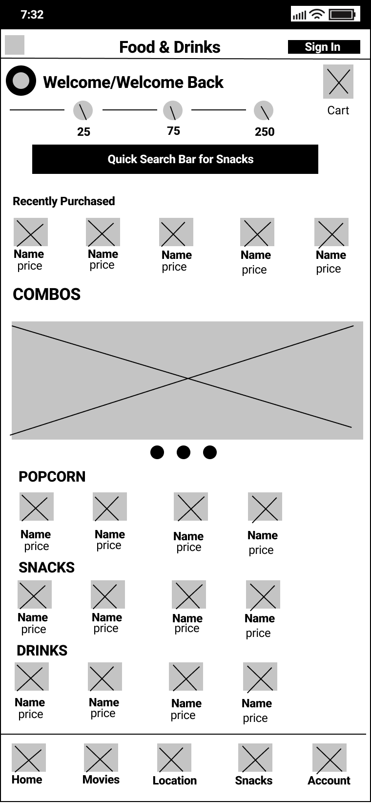

TOP BAR & NAVIGATION
The top bar of the app remains fairly straightforward only showing the name of the screen the user is currently on along with any relevant buttons including buttons that go backward in process or to close out of something. Because this bar is consistent in the user’s experience, I decided it was best to keep it as uncluttered as possible.
The navigation for this app occurs along the bottom and with only five items it fits nicely. Though only the home and snacks have wireframed main screens in this example, each navigation item is expected to be functional from any screen.
HOME
The home screen is the first screen anyone would see when opening the app. Because in similar apps like this one, the homepage tends to get in the way of the content users truly want to see, I decided to utilize this page to display only features items of the theater. The design allows for featured movies and rewards to be highlighted and below display showtimes for movies playing nearby the user. Underneath is a clear call to action that allows the user to sign in or create an account to claim featured rewards and earn points.
While there are no call-to-actions on the main screen of the home page itself, tapping on each feature section would bring up a screen with more info and the option for the movies and rewards.
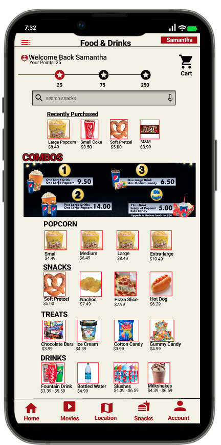
SNACKS
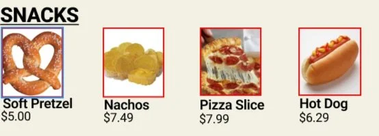
Being the main focus of this app, these screens were ones I spent the most time thinking about and wireframing out on paper before taking digital. The inspiration for the main screen design came from the Cinemark app, which was the cleanest compared to its competitors. Snacks are split into the categories of popcorn, snacks, and drinks. While any combos or deals currently running would be presented above them showing users what options could be added to their cart. I also created a Recently Purchased feature to allow returning users to easily place orders and refills.
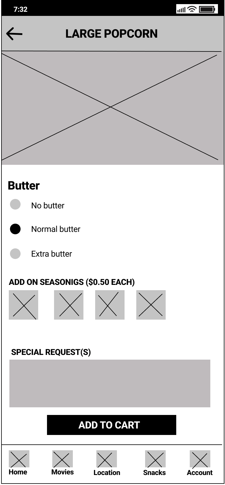
Though there are various snacks available at movie theaters, the main snack I chose to design was popcorn, which is often known to be the more popular choice. I decided on popcorn because it has more options than the average snack with a choice between the amount of butter, seasonings, and special requests. The size is pre-selected having been chosen on the main screen. While other options would be presented as radio button selections, seasonings were presented in a side-scrolling format making multi-select easier with limited scrolling necessary.
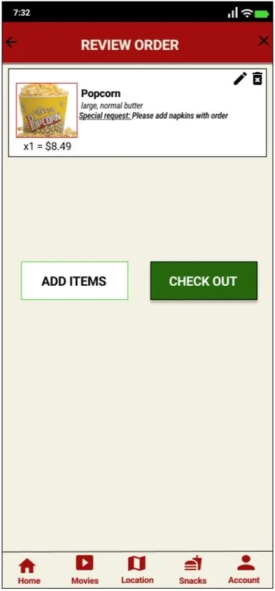
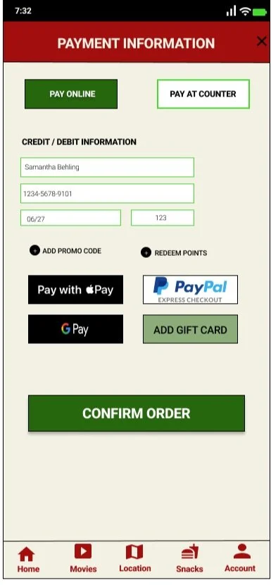
CHECKOUT PROCESS
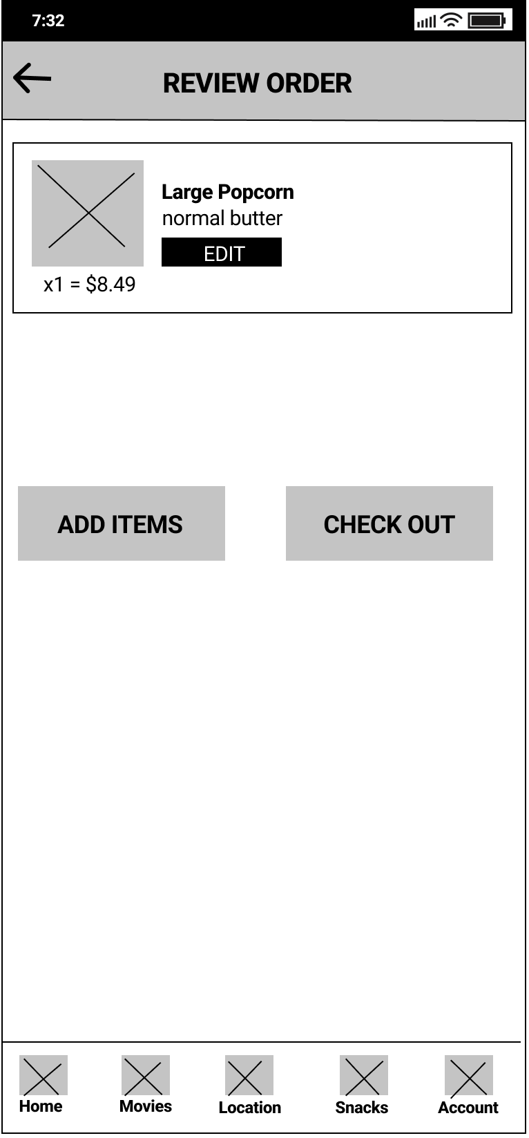
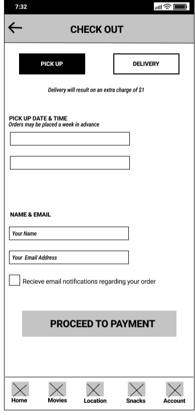
Once a snack is added to the cart, it makes the most sense to be able to review the cart before proceeding. This review order screen would appear anytime someone added an item to their cart along with anytime someone returned to their cart after having navigated to a different page. Items can be removed or modified individually and there is an option to either add more items or check out.
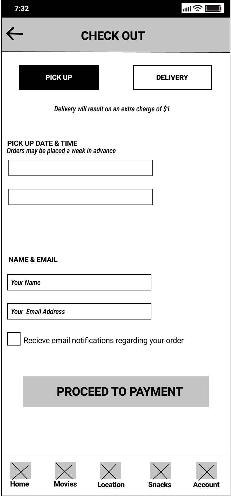
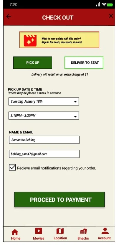
The first actual step of checking out includes selection between pick-up or delivery of snack items, with delivery clearing showing it would be an extra charge. This screen also provides both a pick-up date and time, which would correspond with movie times giving a 15 minute window before each showing. Both the user’s name and email address will be asked for at this time, which is common for most food ordering apps.
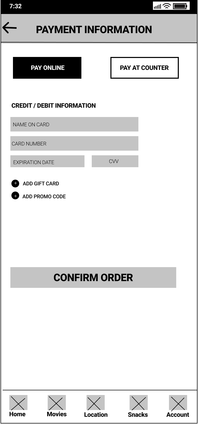
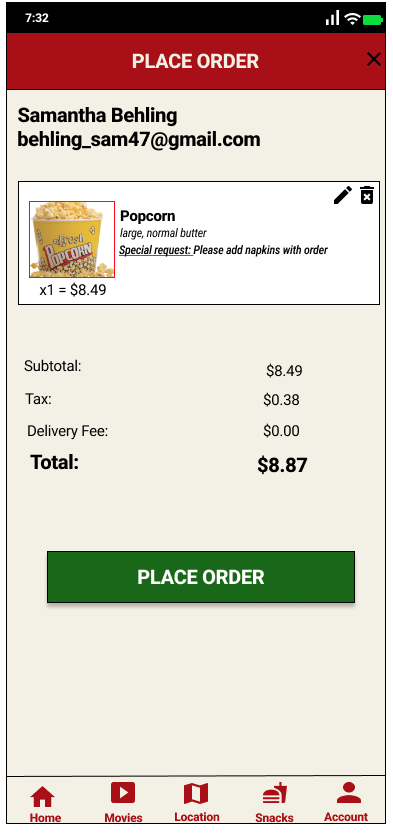
When it comes to the payment step, users have the option between selecting to pay online or paying at the counter. Those who choose to pay at the counter, don’t need to enter additional information on this screen, which means only the pay online option has been depicted. For those paying online, they are expected to pay with either a credit or debit card though there are options to apply gift cards or any promo codes that they may have.
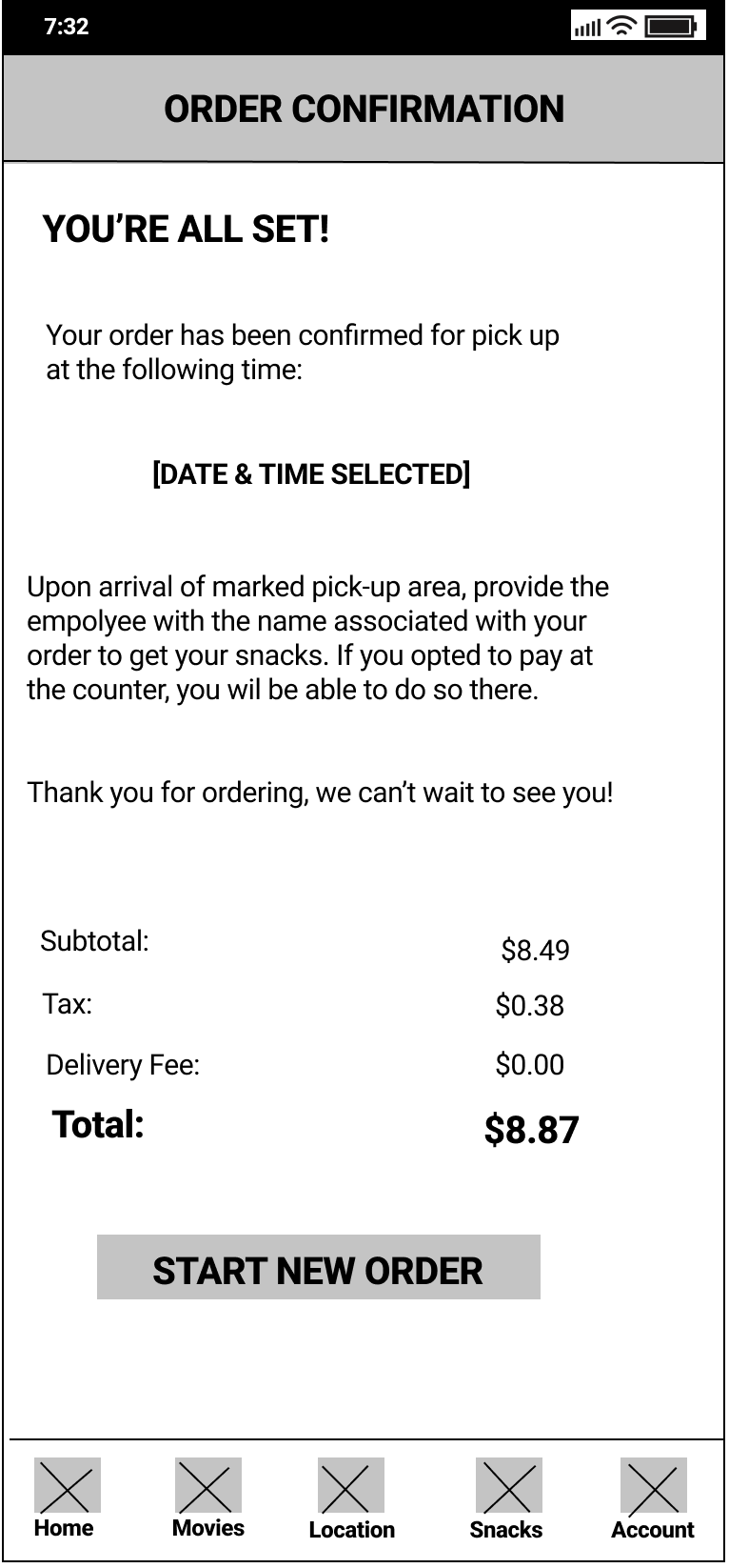
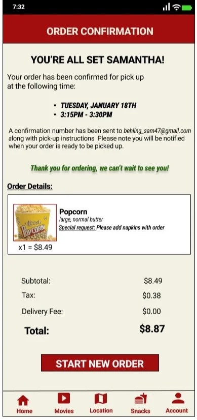
An order confirmation screen is the last step prior to the order being done. It simply reiterates information provided perviously for a final check. In majority of the cases, the order can be placed with a screen showing instructions for those opting to pick up their order.
UX Research Study
Once the prototype was set up and ready to go, I was confident to put this product to test with real potential users and receive their feedback. Though not many are accustomed to seeing low-fidelity work and most feedback is received from high-fidelity prototypes, it is still important to gather feedback from every stage of the process. For me, it was important to confirm that the ordering process was intuitive enough for users while understanding what difficulties they might face during the process.
Specifically, I wanted to measure the user error rate and conversation rate for my KPIs. The purpose of this study was to confirm users were able to successfully complete a purchase and that they could easily navigate back to their cart if having to leave the screen for any reason. Most importantly, if the user got stuck at any point in the process, I wanted to be able to identify the issue and clear it up for them.
USABILITY TEST
The usability test was unmoderated and consisted of five participants ages 18-62 who attend movies either alone or in groups of 2-4 people. One participant regularly used a magnified screen on devices due to visual impairment. Each session lasted approximately 15 minutes and consisted of the following prompts and follow-ups:
Prompt: Add a snack to your cart.
Follow-up: How easy was this task to complete?Prompt: Add a second snack to your cart.
Follow-up: How easy was this task to complete?Prompt: Go to any other screen, then return to your cart.
Follow-up: How easy was this task to complete?Prompt: Complete the checkout process for all items in your cart.
Follow-up: Is there anything you would change about this process?Prompt: Do you see any possible uses for this application?
Follow-up: Would you personally use this application?Prompt: How did you feel about this application overall?
Follow-up: Can you tell me what you like and dislike about this application?
Initially, my prompts only included going through the checkout process for a single item and asking participants at the end how they felt about the overall application. However, I decided to add extra time to add a second snack as well as ask about application uses to provide me with more helpful information while encouraging participants (most being unfamiliar with usability studies) to engage more with the prototype in order to be more open with their feedback.
During the usability test, I took notes down about the participants’ observations and quotes along with how easy or difficult they found each task to be which can be found in the link spreadsheet, which I had created prior to conducting the study.
RESULTS
The majority of the participants spoke in a positive tone while using the application, demonstrating either confidence or curiosity throughout the process. Participants also found the app to be useful, while most said they would use it before arriving at the theater, two also stated they would also use it while at the theater - one even saying they would like to use it while waiting in line.
The navigation along the bottom was well-received, however, the placement of the cart notification was not. As a whole, participants expressed a desire to view their cart and confirm it was empty, something that was not considered during the initial design process. Contrary to that, the option to “add more items” next to “check out” in the cart was used by all but one participant, noting they liked seeing that option.
Most of the feedback was received in relation to the overall checkout process within the app. As they went through the process, several participants noted the expensive prices of the snacks and how they would be more likely to purchase snacks if there were some form of a points or reward system when placing orders. In addition, all participants expressed confusion when they completed the process, while some wanted to see the items they had ordered despite being able to view them from the previous screen, others honed in on the instructions. Despite both the pickup date and time along with instructions on how to pick up orders, participants asked if they would be notified through their phones when their order is ready, some asking why an email address had to be provided if it doens’t appear to be used elsewhere.
Using the affinity diagram along side the notes I had taken allowed me to place all the feedback received into perspective and create the following takeaways from the usability test:
The bottom navigation was a correct choice for this app
The snack screen would receive more feedback if images were available
The cart screen offers a good set of options for items and next steps
Ratherthan receving a notification, there should be a more dedicated way to get back to the cart
There should be some reward system when placing an order or log into an account for returning users
The confirmation screen needs a slight redesign with more clear pickup instructions
HIgh-Fidelity design
Upon receiving feedback from the usability test, I was ready to start working on the high-fidelity design and make changes to the base structure of the design keeping in mind the key takeaways from the usability test. Personally, during this process, the one aspect I wanted to focus on most was the images of snacks within the app. Of course other aspects such as typography, proportion, and color play key roles in a good design, but for me, it was all about the images.
While completing the competitive audit, I noticed the lack of images provided within each movie theater app. While they offered a clear title and price for each snack, the apps failed to provide a corresponding image for most of the snacks offered. With that in mind, I wanted to ensure my designs included clear photos of each snack for users to see as they placed an order.
Adding images next to each snack allows users to easily navigate within the snacks screen when searching for items to add to their cart. Rather than having to search for the name of the snack, users can quickly refer to the image of the snack they are looking for as they scroll and quickly place an order - which is extremely useful for those wanting refills or additional snacks while already in the theater watching a movie. The images allow for accessibility for those who are visually impaired and have a hard time reading ensuring they are adding the items they want with ease and with no frustration providing a smooth experience.
In addition to adding images, I decided to use Roboto as my main font throughout the app and applied features such as font size, boldness, and colors for any accents - such as snack item names and headings - allowing for consistency. Enhancing the font through size and colors for any accents within the app allows users to not be too surprised or confused with any change when emphasizing sections making them still readable. In regards to the color scheme, I wanted to stick with Galaxy Theater’s interior theme, a neutral base with burgundy accents, keeping both the app and theater consistent and uniform to one another.
NAVIGATION
Personally, the navigation of an app makes or breaks the entire user experience. When looking at navigations within an app, I look for icons that match certain branding and help inform what a user is tapping on provided there are clear labels that are easy to read and described in one word or less. Though I did not create any of the icons designed within this app, I did spend time looking for ones that ensured met all the qualifications listed above.
For home, I knew I wanted to use a house as the icon to ensure users are able to easily find their way back to the main page of the app once completing an order.
For movies, I wanted to use a film reel as the icon but was unable to find any that would be recognizable at such a small size. Instead, I opted to use a play button indicating it will take them to the movies page where they can look up showtimes for movies.
For location and account, I kept it simple and decided to use icons matching the style of the rest. I decide to place the location in the center for users to easily select their theater location prior to placing orders or looking up showtimes.
For snacks, I wanted to use popcorn as the icon but realized that though popcorn is the more popular item at a movie theater it is not the only snack item. Instead, I used a generic snack icon to ensure users that the theater offers more than just popcorn for snack options.
All icons used can be found at https://fonts.google.com/icons
CHANGES FROM LOW-FIDELITY WIREFRAMES
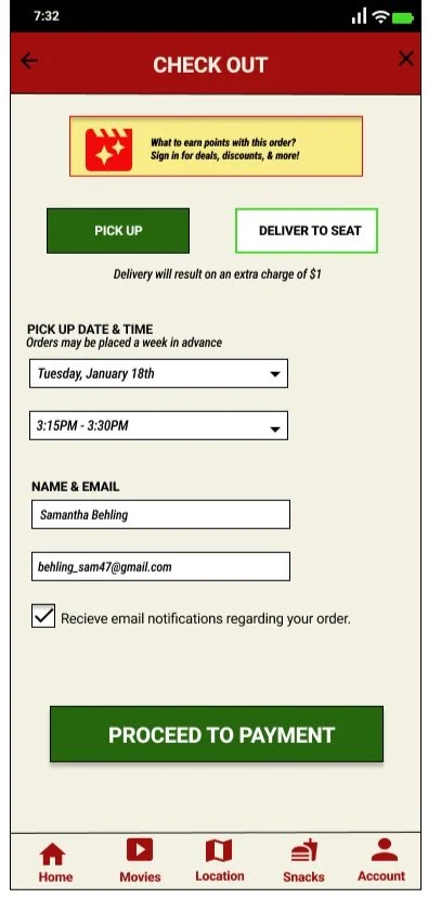
While it is clear that the high-fidelity designs look extremely different than the low-fidelity ones, there are also some very specific changes made in response to the feedback received during the usability testing. Resulting in not only a slightly different look but also changing the flow of the prototype providing a more realistic feel to the product.
BEFORE USABILITY STUDY
AFTER USABILITY STUDY


CART
The first change was adding a cart to the home page. Before, users were only able to retrieve to their cart by going to the snacks page then selecting on the cart icon to take them to their cart. During the usability study, this made many participants frustrated wanting to be able to access the cart from the homepage as they navigated within the app. This prompted me to add the cart icon to the homepage to make it easier for users to check out and access it.
NOTIFICATIONS
Another change was adding the option to receive email notifications regarding orders. Prior to this add-on, users only received an email notification when their order was complete for pick-up. While testing the low-fidelity design, many participants noted they would prefer receiving notifications in regard to their order from start to finish including any delays involved. Prompting me to add the feature to receive notifications of order status including one indicating whether the order has been completed early or if the order is behind schedule.
FULL CHECKOUT PROCESS

TAKEAWAYS
From initial user research, creating personas and journey maps, making competitive audits, designing a low-fidelity prototype for testing then redefining the user experience with high-fidelity designs, the app for Galaxy Theater has come a long way and is ready for its potential.
In general, most of the reception from the usability study has been positive including countless compliments on the UX, copywriting, and prototype wiring functionality. With that being said, if brought to the real world, the app would be considered useful by majority of people while also helping the overall goal to increase snack sales at the theater.
[Theoretical] Next Steps
Considering this project is part of a Google UX Design Certificate program there are no real next steps to be taken. However, if that was not the case, the next step would be to hand this part of the design off to the development team, where they would work on the screens including the logistics within the screens such as account sign-in.
Stakeholders of the movie theater would need to be consulted in order to see how feasible it would be to send push notifications when orders are ready - as it may require additional work from the theater’s POS system along with logistics involving the delivery and pickup features.
Along with that, secondary action would be taken for the UX design, in which other aspects within the app such as movie information, seat selection, location account screen along with email notifications would need to be designed and tested to ensure for a smooth user experience throughout the app.
What I Learned
Throughout the design process for this mobile app, I learned that the initial ideas are only the start of creating it. As I continue with usability studies and peer feedback influencing each iteration of the app’s design I can only improve the user experience with each update and add-on features.
In addition, I learned about how different users interact within a mobile app compared to how I would. Though it is easy to create something for yourself, it’s also important to remember that you are not the target audience when implementing such designs.
Overall, I feel I have started to familiarize myself with the concepts of UX Design through the process of putting together the Galaxy Theater app and hope to only improve as I continue to take on more projects such as this one.